Difference between revisions of "Xerte Handout"
| (26 intermediate revisions by 2 users not shown) | |||
| Line 13: | Line 13: | ||
==== Login and Logout ==== | ==== Login and Logout ==== | ||
| − | * Once you have your login information, you can log in to https://karnatakaeducation.org.in/lcads/ webpage, as shown in | + | * Once you have your login information, you can log in to https://karnatakaeducation.org.in/lcads/ webpage, as shown in Fig1 by entering the credentials. |
<gallery mode="packed" heights="300px"> | <gallery mode="packed" heights="300px"> | ||
| Line 19: | Line 19: | ||
</gallery> | </gallery> | ||
| − | * As seen in | + | * As seen in Fig2, you can log out of your profile by clicking the "logout" button. |
<gallery mode="packed" heights="300px"> | <gallery mode="packed" heights="300px"> | ||
File:Logout Option.png|Fig2: Logout option | File:Logout Option.png|Fig2: Logout option | ||
| Line 25: | Line 25: | ||
==== Interface of tool ==== | ==== Interface of tool ==== | ||
| − | The Xerte online tool's interface is depicted in | + | The Xerte online tool's interface is depicted in Fig3, and the marked areas are described in full below for your reference. |
<gallery mode="packed" heights="430px"> | <gallery mode="packed" heights="430px"> | ||
File:Fig 3- Interface main page.png|Fig3: Interface main page | File:Fig 3- Interface main page.png|Fig3: Interface main page | ||
| Line 38: | Line 38: | ||
# '''Publish:''' It is utilized to maintain control over the project specifics, license, and access. | # '''Publish:''' It is utilized to maintain control over the project specifics, license, and access. | ||
# '''URL of Xerte tool:''' This is the URL for the Xerte online tool, which is embedded in the Karnataka Education server. | # '''URL of Xerte tool:''' This is the URL for the Xerte online tool, which is embedded in the Karnataka Education server. | ||
| − | # '''Folder structure:''' Created folders or directories will appear as shown in | + | # '''Folder structure:''' Created folders or directories will appear as shown in Fig3, numbered 9. |
| − | # '''Created project:''' Created projects will appear as shown in | + | # '''Created project:''' Created projects will appear as shown in Fig |
| + | # 3, numbered 10. | ||
# '''Search:''' It is used to search for a certain project or folder by name or keyword. | # '''Search:''' It is used to search for a certain project or folder by name or keyword. | ||
# '''Sort option:''' Sorting by name (from ‘A to Z’ and ‘Z to A’) and by age (from ‘new to old’ and ‘old to new’) is made easier with the help of this option. | # '''Sort option:''' Sorting by name (from ‘A to Z’ and ‘Z to A’) and by age (from ‘new to old’ and ‘old to new’) is made easier with the help of this option. | ||
| Line 49: | Line 50: | ||
=== Creating/Editing project === | === Creating/Editing project === | ||
| − | The Xerte project is incredibly easy to create and edit. Click the "create" button to start a new project, and to edit click on the “edit” button, as indicated above ( | + | The Xerte project is incredibly easy to create and edit. Click the "create" button to start a new project, and to edit click on the “edit” button, as indicated above (Fig3), to make changes. You may now see all the components or alternatives that Xerte offers to enhance the richness and interactivity of your projects. As soon as you begin developing or changing your project, click the ‘insert’ button (as shown in Fig5) to access further options and add any Xerte elements that are accessible. |
'''NOTE :''' Whenever you want to add an element to the Xerte project, once you choose the element type, you would have three options. | '''NOTE :''' Whenever you want to add an element to the Xerte project, once you choose the element type, you would have three options. | ||
| Line 88: | Line 89: | ||
The user should select "Insert --> Media --> Audio slideshow" to use this element. | The user should select "Insert --> Media --> Audio slideshow" to use this element. | ||
| − | Once the element has been added, the user can upload audio by selecting the "import media" option, which will open the new window depicted in ( | + | Once the element has been added, the user can upload audio by selecting the "import media" option, which will open the new window depicted in (Fig6). Users can choose audio from their system by clicking the "no files selected" (Fig7) button and then click "upload." |
After uploading is complete, the user can effectively add a file to the project by double-clicking on it. Using the same technique, the user can also add photos to the project, sync the images, and add audio by adding the audio in seconds format in sync points. Additionally, users can format their text content by selecting the "Show toolbar" option, and they can even alter the page's title. Please go through the sample below.<gallery mode="packed" heights="300px"> | After uploading is complete, the user can effectively add a file to the project by double-clicking on it. Using the same technique, the user can also add photos to the project, sync the images, and add audio by adding the audio in seconds format in sync points. Additionally, users can format their text content by selecting the "Show toolbar" option, and they can even alter the page's title. Please go through the sample below.<gallery mode="packed" heights="300px"> | ||
| Line 103: | Line 104: | ||
To include a PDF file in the project, user must select "Insert→media→pdf file". | To include a PDF file in the project, user must select "Insert→media→pdf file". | ||
| − | Once the PDF element has been added, the user can upload the PDF by selecting "import media". A new window will appear ( | + | |
| + | Once the PDF element has been added, the user can upload the PDF by selecting "import media". A new window will appear (Fig6). Users can choose a PDF file from their computer by clicking the "no files selected" (Fig7) button, then browse for the file and click "upload." The user can effectively add a file to the project by double-clicking it after uploading it to the Xerte tool. User can edit the title of the element by using the first text box. | ||
<gallery mode="packed" heights="300px"> | <gallery mode="packed" heights="300px"> | ||
File:Fig10 Adding pdf to the project.png|Fig10: Adding pdf to the project | File:Fig10 Adding pdf to the project.png|Fig10: Adding pdf to the project | ||
| Line 113: | Line 115: | ||
To use this element user should click on “insert→media→transcript reader”. | To use this element user should click on “insert→media→transcript reader”. | ||
| − | Once the element has been added, user can upload the audio by clicking the “import media” button which will pop a new window as shown in | + | Once the element has been added, user can upload the audio by clicking the “import media” button which will pop a new window as shown in Fig6, where the user can click on the “no files selected” (Fig7) button and can browse the computer to select the audio. Click on upload. Once the file is uploaded, user can double-click on the file to get it added to the project. To add the text to make it synch with audio, click New text. It shows another page where user can add text and in the synch point mention the timing of audio in seconds format. For example, if the text is starting from 12<sup>th</sup> second, mention 12 in the synch point. On the other side, text can be formatted by clicking on “Show toolbar” option and can change the title of the page as well. Please go through the below example (Figs11 and 12). |
<gallery mode="packed" heights="350px"> | <gallery mode="packed" heights="350px"> | ||
File:Fig11 Adding the audio to the project.png|Fig11: Adding the audio to the project | File:Fig11 Adding the audio to the project.png|Fig11: Adding the audio to the project | ||
| Line 124: | Line 126: | ||
To use this element user should click on “Insert--> Media--> Video”. | To use this element user should click on “Insert--> Media--> Video”. | ||
| − | Once video element is added, user can upload the video by clicking the “Import media” button which will pop a new window shown in | + | Once video element is added, user can upload the video by clicking the “Import media” button which will pop a new window shown in Fig6. User can click on the “no files selected” (Fig7) button and can select the video from their system and click on upload by browsing the file. Once uploading is done user can double-click on the file to add it to the project effectively. User can change the page title, add the description for video as shown in below image. (Figs13 and 14) |
| − | <gallery mode="packed" heights=" | + | <gallery mode="packed" heights="300px"> |
| − | File:Fig13 Adding the Video to the project.png|Fig13: Adding the Video to the project | + | File:Fig13 Adding the Video to the project.png|Fig13: Adding the Video to the project |
| − | + | File:Fig14 After adding the image changing the page title and adding the description.png|Fig14: After adding the image changing the page title and adding the description | |
| − | |||
| − | File:Fig14 After adding the image changing the page title and adding the description.png|Fig14: After adding the image changing the page title and adding the description | ||
</gallery> | </gallery> | ||
| Line 139: | Line 139: | ||
The user should select "insert→navigators→flashcard" to use this component. | The user should select "insert→navigators→flashcard" to use this component. | ||
| − | When the element has been added, the user can add the page title and text for the page in accordance with the requirements. To add a flashcard to the project, the user should click "new card" as shown in the image below ( | + | When the element has been added, the user can add the page title and text for the page in accordance with the requirements. To add a flashcard to the project, the user should click "new card" as shown in the image below (Fig15). Once the user clicks on ‘new card’, a new page will appear in which the user can add an image and an audio file as shown in (Fig16) and text in accordance with the user’s requirements on both sides. |
<gallery mode="packed" heights="300px"> | <gallery mode="packed" heights="300px"> | ||
File:Fig15 Adding the flashcard.png|Fig15: Adding the flashcard | File:Fig15 Adding the flashcard.png|Fig15: Adding the flashcard | ||
| − | |||
| − | |||
File:Fig16 Adding the content to the both the sides of flashcard.png|Fig16: Adding the content to the both the sides of flashcard | File:Fig16 Adding the content to the both the sides of flashcard.png|Fig16: Adding the content to the both the sides of flashcard | ||
</gallery> | </gallery> | ||
| Line 154: | Line 152: | ||
The user needs select "insert→connectors→hotspot image connector" and then "hotspot image connector" to use this element. | The user needs select "insert→connectors→hotspot image connector" and then "hotspot image connector" to use this element. | ||
| − | Users have the option of adding the page title, page content, text alignment, and highlight hotspot option, which can highlight an image while the project is being played, the size of the picture, and the activity description.<gallery mode="packed" heights="350px"> | + | Users have the option of adding the page title, page content, text alignment, and highlight hotspot option, which can highlight an image while the project is being played, the size of the picture, and the activity description. |
| + | |||
| + | <gallery mode="packed" heights="350px"> | ||
File:Fig17 Various option of hotspot image connector.png|Fig17: Various option of hotspot image connector | File:Fig17 Various option of hotspot image connector.png|Fig17: Various option of hotspot image connector | ||
| − | |||
File:Fig18 Merged similar images as single image.jpg|Fig18: Merged similar images as single image | File:Fig18 Merged similar images as single image.jpg|Fig18: Merged similar images as single image | ||
| − | </gallery>After inserting the image user should click on the new hotspot which will take the user to a new page. On the new page, double-click on “edit hotspot”, it will open the image and allow the user to mark the difference. Once a marking is done user should click on “new hotspot” to add the next marking difference. | + | </gallery> |
| + | |||
| + | '''Note:''' We advise users to combine two similar-type photographs that are side by side before uploading them. After that, they can submit the combined image to the element as shown in the below image. | ||
| + | After inserting the image user should click on the new hotspot which will take the user to a new page. On the new page, double-click on “edit hotspot”, it will open the image and allow the user to mark the difference. Once a marking is done user should click on “new hotspot” to add the next marking difference. | ||
| + | |||
<gallery mode="packed" heights="300px"> | <gallery mode="packed" heights="300px"> | ||
File:Fig19 Marking the hotspot (Difference).png|Fig19 Marking the hotspot (Difference) | File:Fig19 Marking the hotspot (Difference).png|Fig19 Marking the hotspot (Difference) | ||
| − | |||
| − | |||
File:Fig20 Adding the 2nd hotspot.png|Fig20: Adding the 2nd hotspot | File:Fig20 Adding the 2nd hotspot.png|Fig20: Adding the 2nd hotspot | ||
</gallery> | </gallery> | ||
| Line 173: | Line 174: | ||
The user should select "insert→interactive tools→dictation" and then "dictation" to use this element. | The user should select "insert→interactive tools→dictation" and then "dictation" to use this element. | ||
| − | The user should then select ‘new sentence’ ( | + | The user should then select ‘new sentence’ (Fig21) to add content. This will take the user to a new page where the user can add images from the toolbar and label the content as well as audio and answer text (Fig22). When the user enters text in the answer text box, it will give feedback as ‘correct’, if the answer matches the answer text; if it doesn't match, it will give feedback as ‘Incorrect’. The user must select "new sentence" again to add the subsequent piece of content. The user can alter the page title or text on the main page after adding the dictation to the project. |
<gallery mode="packed" heights="350px"> | <gallery mode="packed" heights="350px"> | ||
File:Fig21 Adding the dictation.png|Fig21: Adding the dictation | File:Fig21 Adding the dictation.png|Fig21: Adding the dictation | ||
| Line 186: | Line 187: | ||
The user should select "insert→interactive tools→gap fill" to utilize this element. | The user should select "insert→interactive tools→gap fill" to utilize this element. | ||
| − | Once the gap fill page has been added to the project, the user can edit its title, introductory text, gap fill text (content for the project), type of interactivity (drag and drop, fill in the blanks, or drop-down menu), and various options in the gap fill text box ( | + | Once the gap fill page has been added to the project, the user can edit its title, introductory text, gap fill text (content for the project), type of interactivity (drag and drop, fill in the blanks, or drop-down menu), and various options in the gap fill text box (Fig23). |
<gallery mode="packed" heights="350px"> | <gallery mode="packed" heights="350px"> | ||
| Line 193: | Line 194: | ||
===== Drag and Drop ===== | ===== Drag and Drop ===== | ||
| − | User can mark the response after entering information in the gap fill textbox by "selecting the answer→ Right click→ Mark word". User can also add several distractors or options from optional attributes to the user to select the correct answer from a variety of options ( | + | User can mark the response after entering information in the gap fill textbox by "selecting the answer→ Right click→ Mark word". User can also add several distractors or options from optional attributes to the user to select the correct answer from a variety of options (Fig24). |
<gallery mode="packed" heights="350px"> | <gallery mode="packed" heights="350px"> | ||
File:Fig24 Selecting Mark word option for answer.png|Fig24: Selecting Mark word option for answer | File:Fig24 Selecting Mark word option for answer.png|Fig24: Selecting Mark word option for answer | ||
</gallery> | </gallery> | ||
| − | There may be a case where you want to use images than words as answers, follow the same steps as above, to add a picture as answer. But instead of selecting "Mark word," choose the answer text that appears in the vertical bar | | ( | + | There may be a case where you want to use images than words as answers, follow the same steps as above, to add a picture as answer. But instead of selecting "Mark word," choose the answer text that appears in the vertical bar | | (Fig25). Next, upload the image by turning on the show toolbar option. |
<gallery mode="packed" heights="350px"> | <gallery mode="packed" heights="350px"> | ||
File:Fig25 Marking images as answer.png|Fig25: Marking images as answer | File:Fig25 Marking images as answer.png|Fig25: Marking images as answer | ||
| Line 204: | Line 205: | ||
===== Fill in blank ===== | ===== Fill in blank ===== | ||
| − | The user can mark the answer by "selecting the answer→ Right click→ Mark word" after entering content in the gap fill text box. This option does not allow for the addition of images; instead, the user can only enter text in this manner ( | + | The user can mark the answer by "selecting the answer→ Right click→ Mark word" after entering content in the gap fill text box. This option does not allow for the addition of images; instead, the user can only enter text in this manner (Figs26 and 27). |
<gallery mode="packed" heights="380px"> | <gallery mode="packed" heights="380px"> | ||
File:Fig26 Marking the answer and selecting option as fill in the blank.png|Fig26: Marking the answer and selecting option as fill in the blank | File:Fig26 Marking the answer and selecting option as fill in the blank.png|Fig26: Marking the answer and selecting option as fill in the blank | ||
| Line 211: | Line 212: | ||
===== Drop down menu ===== | ===== Drop down menu ===== | ||
| − | The user can mark the answer by "selecting the answer→ Right click→ Mark word" after adding content to the gap-fill text box. In this option, the user cannot upload a picture; they are only able to provide words. The user can enter numerous responses inside the vertical bar | |, each answer being separated by the forward slash "/". The correct answer should be placed first, followed by a / add the distractors (many alternatives) ( | + | The user can mark the answer by "selecting the answer→ Right click→ Mark word" after adding content to the gap-fill text box. In this option, the user cannot upload a picture; they are only able to provide words. The user can enter numerous responses inside the vertical bar | |, each answer being separated by the forward slash "/". The correct answer should be placed first, followed by a / add the distractors (many alternatives) (Fig28). |
<gallery mode="packed" heights="350px"> | <gallery mode="packed" heights="350px"> | ||
File:Fig28 Marking the answer and Choosing the down down option.png|Fig28: Marking the answer and Choosing the down down option | File:Fig28 Marking the answer and Choosing the down down option.png|Fig28: Marking the answer and Choosing the down down option | ||
</gallery> | </gallery> | ||
| − | '''Note:''' The user should activate the "Mark at end" option from the optional properties which allows the end user to choose the wrong answers. Then, after clicking "Submit" the end user will receive feedback on whether the selected response is correct or incorrect. ( | + | '''Note:''' The user should activate the "Mark at end" option from the optional properties which allows the end user to choose the wrong answers. Then, after clicking "Submit" the end user will receive feedback on whether the selected response is correct or incorrect. (Figs29 and 30). |
<gallery mode="packed" heights="350px"> | <gallery mode="packed" heights="350px"> | ||
File:Fig29 Adding Mark at end.png|Fig29: Adding Mark at end | File:Fig29 Adding Mark at end.png|Fig29: Adding Mark at end | ||
| Line 227: | Line 228: | ||
The user should choose "insert→interactive tools→Matching text" to utilize this element. | The user should choose "insert→interactive tools→Matching text" to utilize this element. | ||
| − | The user can add the "page title, introduction text, feedback, and attempts before hint". Once the user adds the matching text page to the project, should also add the "mark at end" option. The user must select "New sentence" from the menu in order to enter content ( | + | The user can add the "page title, introduction text, feedback, and attempts before hint". Once the user adds the matching text page to the project, should also add the "mark at end" option. The user must select "New sentence" from the menu in order to enter content (Fig31). |
| − | + | <gallery mode="packed" heights="400px"> | |
| − | After selecting "New sentence," the user may add a picture, text, or audio in part 1 and the same in part 2 so that part 1 and part 2 can be matched appropriately by the end user. To add the next content, the user should click on "New sentence" again ( | + | File:Fig31 Adding the details in matching text main page and adding "mark at end" option.png|Fig31: Adding the details in matching text main page and adding "mark at end" option |
| + | </gallery> | ||
| + | After selecting "New sentence," the user may add a picture, text, or audio in part 1 and the same in part 2 so that part 1 and part 2 can be matched appropriately by the end user. To add the next content, the user should click on "New sentence" again (Fig32). | ||
| + | <gallery mode="packed" heights="400px"> | ||
| + | File:Fig32 Adding the content to matching the text.png|Fig32: Adding the content to matching the text | ||
| + | </gallery> | ||
===== Multiple choice question ===== | ===== Multiple choice question ===== | ||
| Line 236: | Line 242: | ||
Click "insert→interactive tools→Multiple choice question" to utilize this element. | Click "insert→interactive tools→Multiple choice question" to utilize this element. | ||
| − | The user may then add the page title, text alignment, introduction text, question, question type (whether single answer or multiple response), and panel width after adding the multiple choice question page to the project. The user must select "New Answer" from the menu in order to add the answer ( | + | The user may then add the page title, text alignment, introduction text, question, question type (whether single answer or multiple response), and panel width after adding the multiple choice question page to the project. The user must select "New Answer" from the menu in order to add the answer (Fig33). |
| + | <gallery mode="packed" heights="400px"> | ||
| + | File:Fig33 Adding the details and question to the multiple choice question main page and clicking on new answer.png|Fig33: Adding the details and question to the multiple choice question main page and clicking on new answer | ||
| + | </gallery> | ||
| − | Once the user finishes selecting "New answer", a new page ( | + | Once the user finishes selecting "New answer", a new page (Fig34) will appear to make it a single answer, the user must choose as ‘single answer’ from the main page; to make it numerous answers, should select multiple answers from the main page (Fig33). |
The user should include two "New answers" for questions of the true-false variety. | The user should include two "New answers" for questions of the true-false variety. | ||
| Line 245: | Line 254: | ||
'''Note:''' On the New Answer screen, the user should pick the right answer as true and the incorrect response as false. | '''Note:''' On the New Answer screen, the user should pick the right answer as true and the incorrect response as false. | ||
| + | |||
| + | <gallery mode="packed" heights="400px"> | ||
| + | File:Fig34 Adding the answers for multiple choice questions.png|Fig34: Adding the answers for multiple choice questions | ||
| + | </gallery> | ||
===== Sortable grid ===== | ===== Sortable grid ===== | ||
| Line 251: | Line 264: | ||
The user should choose "insert→interactive tools→Sortable Grid" to utilize this element. | The user should choose "insert→interactive tools→Sortable Grid" to utilize this element. | ||
| − | After adding the sortable grid page to the project, the user may then add the page title, page text, feedback ( | + | After adding the sortable grid page to the project, the user may then add the page title, page text, feedback (Fig35), and content to the provided table in the appropriate order. For example, by adding the first word or image to the first column, the second to the second column, and so on. |
| + | <gallery mode="packed" heights="400px"> | ||
| + | File:Fig35 Adding the details to the main page.png|Fig35: Adding the details to the main page | ||
| + | File:Fig36 Adding the data to the table.png|Fig36: Adding the data to the table | ||
| + | </gallery> | ||
| − | '''Note:''' Double-clicking on data cells in tables will allow you to add content ( | + | '''Note:''' Double-clicking on data cells in tables will allow you to add content (Fig37). To change the number of rows and columns, click the add column and add row buttons, respectively. |
| + | <gallery mode="packed" heights="400px"> | ||
| + | File:Fig37 Adding images and columns.png|Fig37: Adding images and columns | ||
| + | </gallery> | ||
==== Inserting Gaming tools ==== | ==== Inserting Gaming tools ==== | ||
| Line 265: | Line 285: | ||
When adding the Hangman page to the project is complete, the user can enter the page's title, instructions, and content in the words column. | When adding the Hangman page to the project is complete, the user can enter the page's title, instructions, and content in the words column. | ||
| − | In the instructions field, question can be added and the corresponding answer can be filled in the ‘words’ field as shown in | + | In the instructions field, question can be added and the corresponding answer can be filled in the ‘words’ field as shown in Fig38. |
| + | |||
| + | <gallery mode="packed" heights="400px"> | ||
| + | File:Fig38 Adding the details and content to the hangman page.png|Fig38: Adding the details and content to the hangman page | ||
| + | </gallery> | ||
| − | The user is given the opportunity to input the phrases, and if they type the incorrect words instead of the ones that are provided, a man-hanging sketch will begin to appear. Either the end user types the entire answer correctly, the game ends with the sketch of a man hanging otherwise as shown in | + | The user is given the opportunity to input the phrases, and if they type the incorrect words instead of the ones that are provided, a man-hanging sketch will begin to appear. Either the end user types the entire answer correctly, the game ends with the sketch of a man hanging otherwise as shown in Fig39. |
| + | <gallery mode="packed" heights="400px"> | ||
| + | File:Fig39 Preview page of hangman game.png|Fig39: Preview page of hangman game | ||
| + | </gallery> | ||
===== Memory game ===== | ===== Memory game ===== | ||
| Line 274: | Line 301: | ||
The user should select "insert→Games→Memory game" to use this component. | The user should select "insert→Games→Memory game" to use this component. | ||
| − | Once the user has added the ‘Memory Game’ page to the project, the user can add the page title. To add the content, the user should click on "new item," which will open a new page. User should click on "label image" from the optional properties, which will get added to the project. After this, the user should upload the same image as the label image, and to add the next image, the user should click on new item again and follow the same process ( | + | Once the user has added the ‘Memory Game’ page to the project, the user can add the page title. To add the content, the user should click on "new item," which will open a new page. User should click on "label image" from the optional properties, which will get added to the project. After this, the user should upload the same image as the label image, and to add the next image, the user should click on new item again and follow the same process (Fig40). |
| + | <gallery mode="packed" heights="400px"> | ||
| + | File:Fig40 Adding the Label image to the project.png|Fig40: Adding the Label image to the project | ||
| + | </gallery> | ||
| − | The system is designed such that when the user clicks on a card, it flips over and displays an image, prompting them to look for that image elsewhere on the page. Two photos will be combined into one when they matched successfully as shown in | + | The system is designed such that when the user clicks on a card, it flips over and displays an image, prompting them to look for that image elsewhere on the page. Two photos will be combined into one when they matched successfully as shown in Fig41. |
| + | <gallery mode="packed" heights="400px"> | ||
| + | File:Fig41 After adding the images to image and label image.png|Fig41: After adding the images to image and label image | ||
| + | File:Fig42 Preview page.png|Fig42: Preview page | ||
| + | </gallery> | ||
===== Word search ===== | ===== Word search ===== | ||
| Line 283: | Line 317: | ||
The user must choose "insert→Games→ Word Game" in order to use this component. | The user must choose "insert→Games→ Word Game" in order to use this component. | ||
| − | Once the Word Game page has been added to the project, the user may add the page title, instructions, and words. Each word should be added to a new line as shown in | + | Once the Word Game page has been added to the project, the user may add the page title, instructions, and words. Each word should be added to a new line as shown in Fig43. The look of the table is in-built will be presented as a puzzle coupled with a word list that must be searched (Fig44) |
| + | |||
| + | <gallery mode="packed" heights="400px"> | ||
| + | File:Fig43 Adding the details and content to the word game.png|Fig43: Adding the details and content to the word game | ||
| + | File:Fig44 Preview of word game.png|Fig44: Preview of word game | ||
| + | </gallery> | ||
==== Tracking tools ==== | ==== Tracking tools ==== | ||
| Line 294: | Line 333: | ||
The user may add a page title and select whether to display ‘Full results’, ‘Normal results’ or ‘Minimal results’ after adding a result page to the project. | The user may add a page title and select whether to display ‘Full results’, ‘Normal results’ or ‘Minimal results’ after adding a result page to the project. | ||
| − | The user can additionally specify that the results must be displayed in the optional properties upon the "full completion" of the project as shown in | + | The user can additionally specify that the results must be displayed in the optional properties upon the "full completion" of the project as shown in Fig45. |
| + | <gallery mode="packed" heights="400px"> | ||
| + | File:Fig45 Selecting the results option and adding full completion.png|Fig45: Selecting the results option and adding full completion | ||
| + | </gallery> | ||
=== Importing page from other project === | === Importing page from other project === | ||
| − | User can | + | User can import the pages or elements from one project to another project by selecting the project and clicking on the "edit project" button to reuse the content or modify and use the content. (Figs46 and 47) |
| + | <gallery mode="packed" heights="400px"> | ||
| + | File:Fig46 Selecting import pages.png|Fig46: Selecting import pages | ||
| + | File:Fig47 Selecting the elements and clicking on import pages to import to current project.png|Fig47: Selecting the elements and clicking on import pages to import to current | ||
| + | </gallery> | ||
| − | === | + | === Duplicating the page or element === |
In order to reuse the content and element in another project or to utilize and change the same project in a new file, the user can replicate the entire project or specific project components. | In order to reuse the content and element in another project or to utilize and change the same project in a new file, the user can replicate the entire project or specific project components. | ||
| − | The user must first choose the project from the home page and then click the "Duplicate" option ( | + | The user must first choose the project from the home page and then click the "Duplicate" option (Fig48). |
| + | |||
| + | <gallery mode="packed" heights="400px"> | ||
| + | File:Fig48 Duplicating the project.png|Fig48: Duplicating the project | ||
| + | </gallery> | ||
| − | The user should choose the project from the main page and then click "Edit Project" to duplicate an element of the project. To duplicate an element, select it and use the "Duplicate" button ( | + | The user should choose the project from the main page and then click "Edit Project" to duplicate an element of the project. To duplicate an element, select it and use the "Duplicate" button (Fig49). |
| + | <gallery mode="packed" heights="400px"> | ||
| + | File:Fig49 Duplication of element of projects.png|Fig49: Duplication of element of projects | ||
| + | </gallery> | ||
=== Deleting of page or activity === | === Deleting of page or activity === | ||
The project or activity can be removed from Xerte by the user. | The project or activity can be removed from Xerte by the user. | ||
| − | The user must choose the project from the home page and then click the "Delete" option to remove it ( | + | The user must choose the project from the home page and then click the "Delete" option to remove it (Fig50). |
| + | |||
| + | <gallery mode="packed" heights="400px"> | ||
| + | File:Fig50 Deletion of project.png|Fig50: Deletion of project | ||
| + | </gallery> | ||
| − | To delete the element, the user should click on the edit button by selecting the project from the main page. The user should select the element and click on the "Delete" button ( | + | To delete the element, the user should click on the edit button by selecting the project from the main page. The user should select the element and click on the "Delete" button (Fig51). |
| + | <gallery mode="packed" heights="400px"> | ||
| + | File:Fig51 Deletion of element from project.png|Fig51: Deletion of element from project | ||
| + | </gallery> | ||
=== Optional properties === | === Optional properties === | ||
| − | Every element has a variety of ‘optional attributes’ that may be supported by the element with more choices to enhance the project. In the descriptions above, we have listed a few of the optional properties that we utilized in our project. On the right side of project ( | + | Every element has a variety of ‘optional attributes’ that may be supported by the element with more choices to enhance the project. In the descriptions above, we have listed a few of the optional properties that we utilized in our project. On the right side of project (Fig52), optional properties are displayed. |
| + | <gallery mode="packed" heights="400px"> | ||
| + | File:Fig52 Optional properties.png|Fig52: Optional properties | ||
| + | </gallery> | ||
=== Show language option and Show toolbar option === | === Show language option and Show toolbar option === | ||
| − | The extra formatting choices of ‘Show toolbar’ and ‘Show language’ offer more feedback and button possibilities to enhance projects ( | + | The extra formatting choices of ‘Show toolbar’ and ‘Show language’ offer more feedback and button possibilities to enhance projects (Fig53). |
| + | <gallery mode="packed" heights="400px"> | ||
| + | File:Fig53 Selecting show toolbar & show language options and the options available after selecting.png|Fig53 Selecting show toolbar & show language options and the options available after selecting | ||
| + | </gallery> | ||
=== Play and publish buttons === | === Play and publish buttons === | ||
| − | The "Play" and "Publish" buttons allow you to "preview" and "save" the project, respectively ( | + | The "Play" and "Publish" buttons allow you to "preview" and "save" the project, respectively (Fig54). |
| − | + | <gallery mode="packed" heights="400px"> | |
| + | File:Fig54 Play & Publish button in project page.png|Fig54: Play & Publish button in project page | ||
| + | </gallery> | ||
=== Elements of properties in interface === | === Elements of properties in interface === | ||
| + | <gallery mode="packed" heights="400px"> | ||
| + | File:Fig55 Properties.png|Fig55: Properties | ||
| + | </gallery> | ||
'''Project''' | '''Project''' | ||
| Line 374: | Line 445: | ||
• Editor (other user will have the controls to edit and modify the project) | • Editor (other user will have the controls to edit and modify the project) | ||
| − | • Read only (other user can only read or play the project) | + | • Read-only (other user can only read or play the project) |
=== Explanation about project details === | === Explanation about project details === | ||
| − | When you click on a specific project from the main page, project information is displayed as shown in | + | When you click on a specific project from the main page, project information is displayed as shown in Fig56, and they are provided as a number Fig56. |
| + | <gallery mode="packed" heights="400px"> | ||
| + | File:Fig55 Properties.png|Fig56: Properties | ||
| + | </gallery> | ||
| + | |||
# Name of the project. | # Name of the project. | ||
| Line 391: | Line 466: | ||
# User name and access control details of shared user. | # User name and access control details of shared user. | ||
# Creators user name | # Creators user name | ||
| + | |||
| + | === Reference === | ||
| + | [https://xerte.org.uk/index.php/en/examples Template demonstrators] | ||
| + | |||
| + | [https://xot.xerte.org.uk/play.php?template_id=116 Tutorial] | ||
| + | |||
| + | [https://xot.xerte.org.uk/play.php?template_id=102#page1 Demo Video] | ||
Latest revision as of 05:59, 4 September 2023
Introduction
The Xerte Project aims to offer top-notch free software to schools all over the world and create a global user and development community around products. Xerte is open-source software for the purpose of producing interactive projects and learning objects for educational systems. It has been hosted on our own Karnataka Education server and is available for free download from the Xerte Community website. It is being used to provide resources for language learning.
Advantages of Xerte
Xerte puts simple tools in the hands of teachers. Learning materials are easily assembled without sacrificing the functionality that designers, developers and media specialists demand. Xerte is a content authoring tool that lets you bring together different types of material in order to present information on a topic. You can include text, images, video, audio as well as embed web pages or web widgets. In addition, you can add activities which allow the viewer to interact with the content.
Working with the application
Working with Xerte is as easy as it appears to be. Before that, we'll go over the procedure for creating an account for Xerte login. Please use the method listed below to establish your account.
Account creation
Only the Tech team admins are permitted to establish Xerte accounts, so anyone wishing to do so must send an email to the Tech team's inbox at "tech-team@itforchange.net". The user ID and password for your Xerte account will be sent to your official email address once the tech staff has created it.
Login and Logout
- Once you have your login information, you can log in to https://karnatakaeducation.org.in/lcads/ webpage, as shown in Fig1 by entering the credentials.

Fig1: Login page

- As seen in Fig2, you can log out of your profile by clicking the "logout" button.
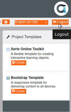
Fig2: Logout option

Interface of tool
The Xerte online tool's interface is depicted in Fig3, and the marked areas are described in full below for your reference.
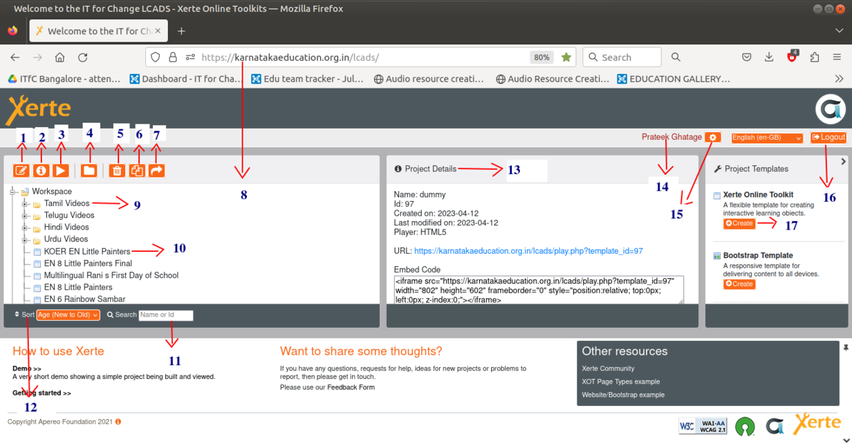
Fig3: Interface main page

- Edit: This option enables users to make additions, deletions, and modifications to all different types of Xerte elements in an already-created Xerte project in the workspace.
- Properties: This option allows the user to view all of the project's properties. The user has the ability to modify, access and manage sharing.
- Preview: The user has the ability to preview the project online in order to test it.
- New folder: For easier understanding, the projects can be organised into folders. The "New folder" button can be clicked by the user to add a new folder to their workspace.
- Delete: Deleting unnecessary projects or folders will help you free up some space in Xerte. Users can delete their project or folder by clicking the "Delete" button.
- Duplicate: If a user wishes to create a second version of the same project or folder, duplication can be useful.
- Publish: It is utilized to maintain control over the project specifics, license, and access.
- URL of Xerte tool: This is the URL for the Xerte online tool, which is embedded in the Karnataka Education server.
- Folder structure: Created folders or directories will appear as shown in Fig3, numbered 9.
- Created project: Created projects will appear as shown in Fig
- 3, numbered 10.
- Search: It is used to search for a certain project or folder by name or keyword.
- Sort option: Sorting by name (from ‘A to Z’ and ‘Z to A’) and by age (from ‘new to old’ and ‘old to new’) is made easier with the help of this option.
- Project details: In this, you can find all the information you need about the project, including the project name, ID, created date, last modified date, URL link to share with others, code to embed the project, size of the project, current access granted to the project, number of views, and shared status of the project.
- User Information: It will display the username.
- Password change option: After clicking this button, the user has the option to modify their password.
- Logout button: It is used to log out from the session.
- New project creation: The user can create their new projects by clicking the ‘create’ button, entering the name, and then clicking the ‘create’ button again.
Creating/Editing project
The Xerte project is incredibly easy to create and edit. Click the "create" button to start a new project, and to edit click on the “edit” button, as indicated above (Fig3), to make changes. You may now see all the components or alternatives that Xerte offers to enhance the richness and interactivity of your projects. As soon as you begin developing or changing your project, click the ‘insert’ button (as shown in Fig5) to access further options and add any Xerte elements that are accessible.
NOTE : Whenever you want to add an element to the Xerte project, once you choose the element type, you would have three options.
Before: If you want to add the element ‘before’ the current element, choose this.
After: If you want to add the element ‘after’ the current element, choose this.
At the end: If you want to add the element ‘at the end’, choose this.
Inserting Text
Plain text
It is used to add plain text to the project so that the user can contribute material like a story, any important information, a summary, an overview, etc.
The user must select “insert--> text --> plain text” in order to use this element.
Once the element has been added, the user can edit the page's title in addition to add the content according to the requirements. User can also format the content by selecting the "Show toolbar" option. Please go through the sample below.
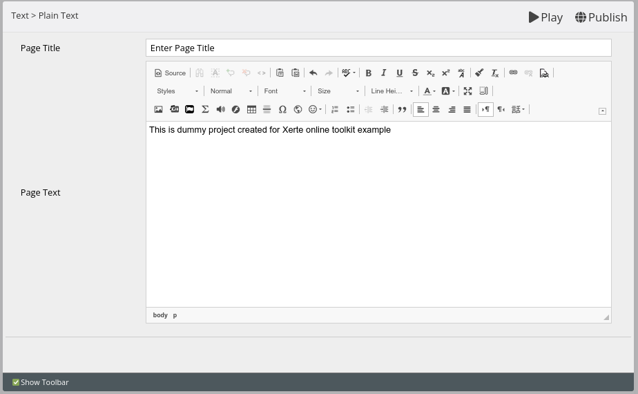
Fig4: Inserting plain text

Title page
The title page is a good reminder to include a title page as the first page of your resource because it will highlight the topic's primary relevance.
The user should select "insert--> text --> title page" to use this element.
Once the element has been added, the user can edit the page's title, update the title content according to their needs, and do the text formatting by selecting "Show toolbar". Please go through the sample below.
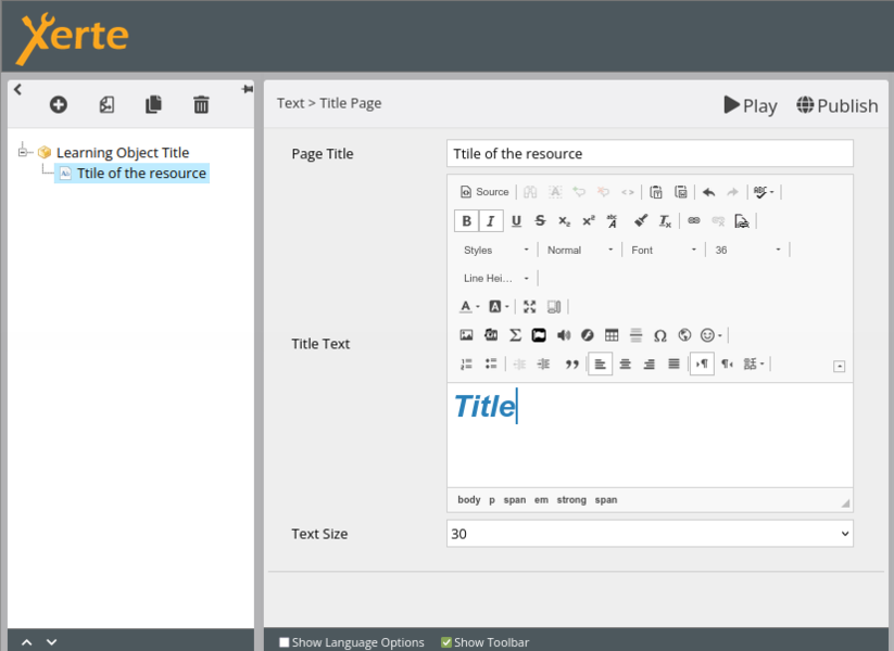
Fig5: Inserting title page

Inserting Media
Audio slideshow
When users wish to play audio and a collection of images or presentations simultaneously, audio slide shows can be quite useful.
The user should select "Insert --> Media --> Audio slideshow" to use this element.
Once the element has been added, the user can upload audio by selecting the "import media" option, which will open the new window depicted in (Fig6). Users can choose audio from their system by clicking the "no files selected" (Fig7) button and then click "upload."
After uploading is complete, the user can effectively add a file to the project by double-clicking on it. Using the same technique, the user can also add photos to the project, sync the images, and add audio by adding the audio in seconds format in sync points. Additionally, users can format their text content by selecting the "Show toolbar" option, and they can even alter the page's title. Please go through the sample below.
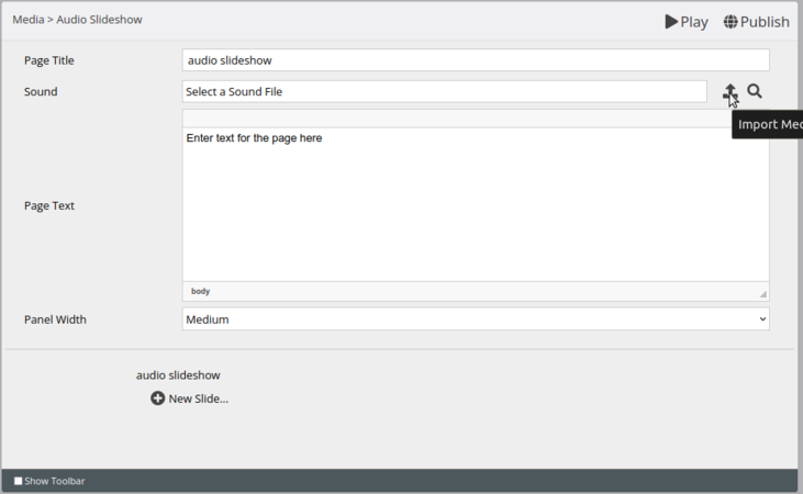
Fig6: Adding the audio to the project

Fig7: Uploading option


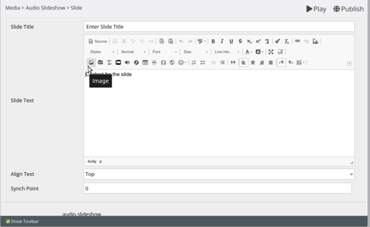
Fig8: Adding the image and sync point option
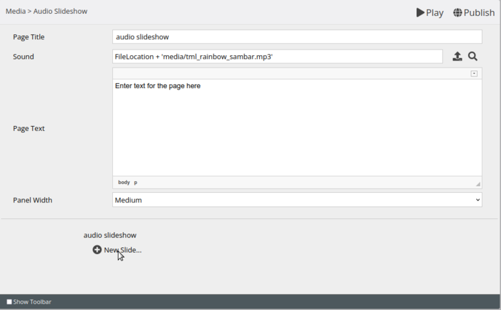
Fig9: After adding the audio to add image into new slide and to sync


Pdf file
Text with image type of content may be easily accessed and read in a PDF document.
To include a PDF file in the project, user must select "Insert→media→pdf file".
Once the PDF element has been added, the user can upload the PDF by selecting "import media". A new window will appear (Fig6). Users can choose a PDF file from their computer by clicking the "no files selected" (Fig7) button, then browse for the file and click "upload." The user can effectively add a file to the project by double-clicking it after uploading it to the Xerte tool. User can edit the title of the element by using the first text box.

Fig10: Adding pdf to the project

Transcript reader
A transcript reader can be very helpful if users want to play audio and text by syncing each together.
To use this element user should click on “insert→media→transcript reader”.
Once the element has been added, user can upload the audio by clicking the “import media” button which will pop a new window as shown in Fig6, where the user can click on the “no files selected” (Fig7) button and can browse the computer to select the audio. Click on upload. Once the file is uploaded, user can double-click on the file to get it added to the project. To add the text to make it synch with audio, click New text. It shows another page where user can add text and in the synch point mention the timing of audio in seconds format. For example, if the text is starting from 12th second, mention 12 in the synch point. On the other side, text can be formatted by clicking on “Show toolbar” option and can change the title of the page as well. Please go through the below example (Figs11 and 12).
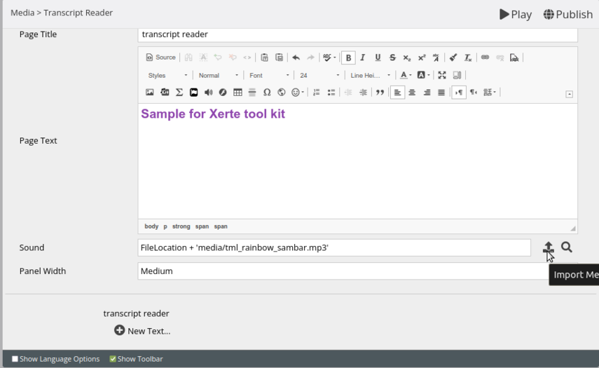
Fig11: Adding the audio to the project
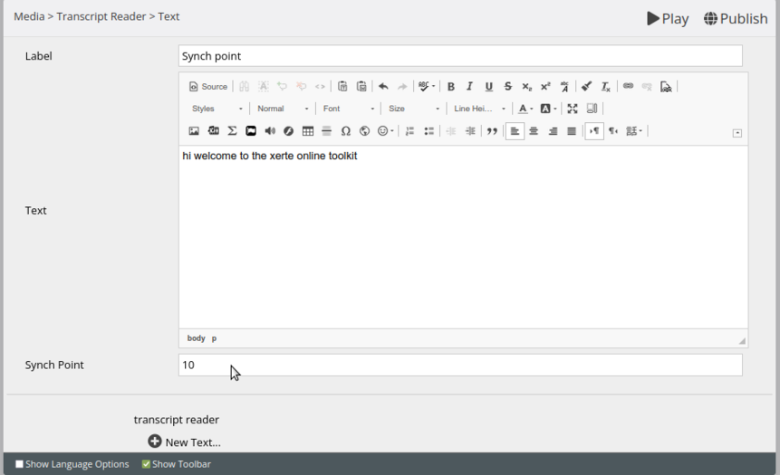
Fig12: Adding text and syncing text to the audio


Video
Adding the Video file makes the project much attractive and understanding.
To use this element user should click on “Insert--> Media--> Video”.
Once video element is added, user can upload the video by clicking the “Import media” button which will pop a new window shown in Fig6. User can click on the “no files selected” (Fig7) button and can select the video from their system and click on upload by browsing the file. Once uploading is done user can double-click on the file to add it to the project effectively. User can change the page title, add the description for video as shown in below image. (Figs13 and 14)
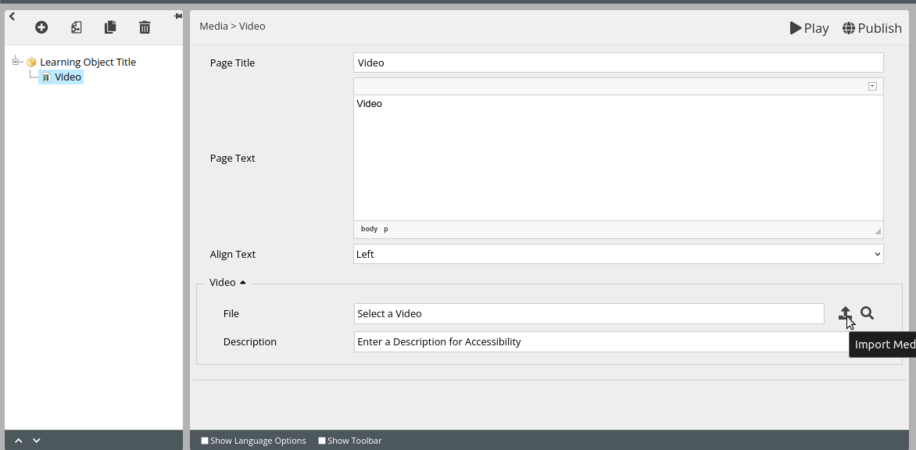
Fig13: Adding the Video to the project
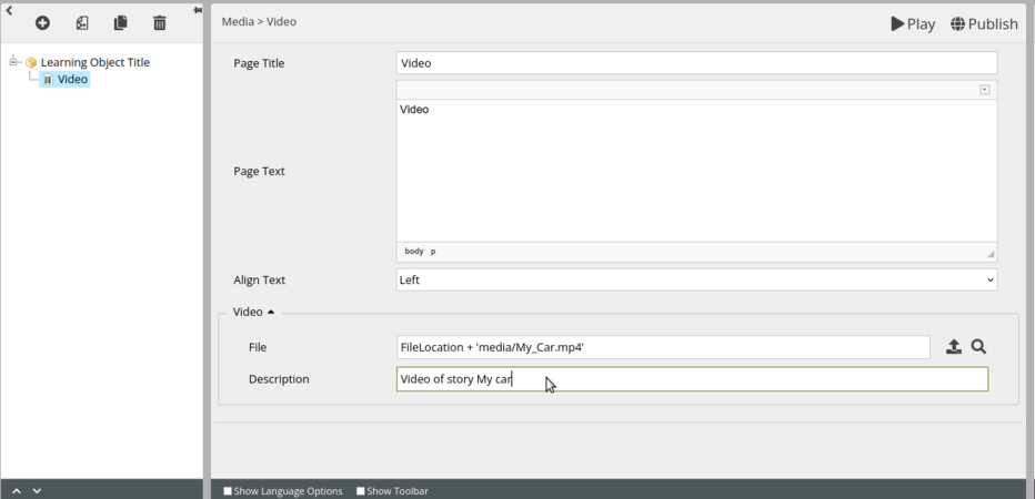
Fig14: After adding the image changing the page title and adding the description


Flashcard
The end user may engage in an interactive activity by adding the Flashcard to the project. We have utilized this game for the comprehension of terminology in our TIIE language lab projects. It allows the user to add two faces for a card, either audio, image, or text.
The user should select "insert→navigators→flashcard" to use this component.
When the element has been added, the user can add the page title and text for the page in accordance with the requirements. To add a flashcard to the project, the user should click "new card" as shown in the image below (Fig15). Once the user clicks on ‘new card’, a new page will appear in which the user can add an image and an audio file as shown in (Fig16) and text in accordance with the user’s requirements on both sides.

Fig15: Adding the flashcard

Fig16: Adding the content to the both the sides of flashcard


Inserting Connectors
Hotspot image connector
The Xerte tool's interactive activity of adding the Hotspot image connection allows the user to add two types of comparable photos and annotate a portion of each image to highlight the differences between them. This activity can be enjoyable for the user while also aiding in memory improvement.
The user needs select "insert→connectors→hotspot image connector" and then "hotspot image connector" to use this element.
Users have the option of adding the page title, page content, text alignment, and highlight hotspot option, which can highlight an image while the project is being played, the size of the picture, and the activity description.
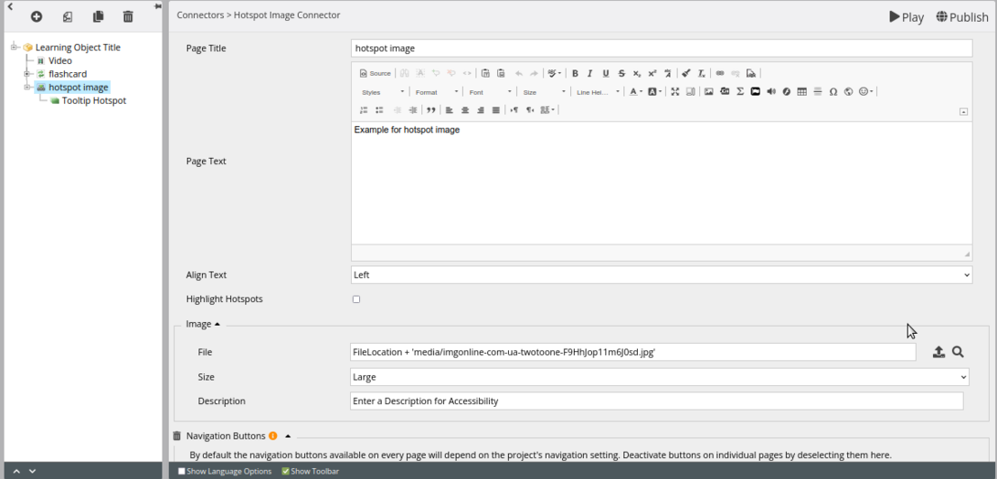
Fig17: Various option of hotspot image connector

Fig18: Merged similar images as single image


Note: We advise users to combine two similar-type photographs that are side by side before uploading them. After that, they can submit the combined image to the element as shown in the below image. After inserting the image user should click on the new hotspot which will take the user to a new page. On the new page, double-click on “edit hotspot”, it will open the image and allow the user to mark the difference. Once a marking is done user should click on “new hotspot” to add the next marking difference.

Fig19 Marking the hotspot (Difference)
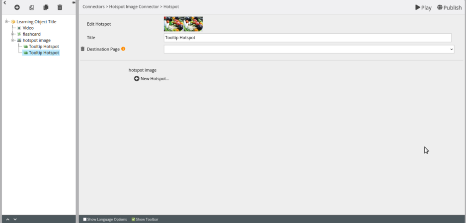
Fig20: Adding the 2nd hotspot
.png)

Inserting Interactive tools
Dictation
Adding the dictation can be a simple way to interpret any audio, visual, or textual content or information. Once understood, the end user should respond and check that the response is correct or not.
The user should select "insert→interactive tools→dictation" and then "dictation" to use this element.
The user should then select ‘new sentence’ (Fig21) to add content. This will take the user to a new page where the user can add images from the toolbar and label the content as well as audio and answer text (Fig22). When the user enters text in the answer text box, it will give feedback as ‘correct’, if the answer matches the answer text; if it doesn't match, it will give feedback as ‘Incorrect’. The user must select "new sentence" again to add the subsequent piece of content. The user can alter the page title or text on the main page after adding the dictation to the project.

Fig21: Adding the dictation

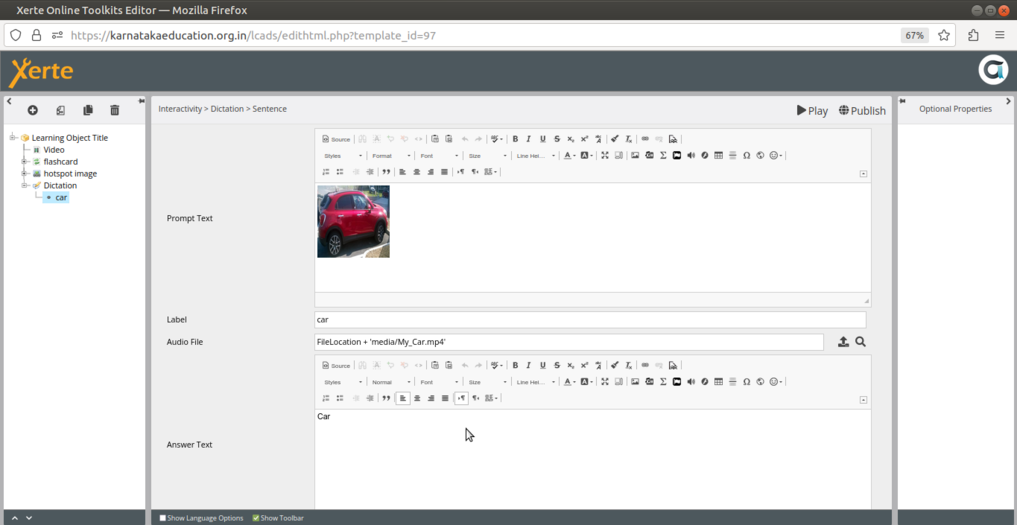
Fig22: Adding content to the dictation

Gap fill
The Gap Fill page asks the user to fill in missing words from a passage of text. There are three types in which we can use Gap fill. A drag and drop works based on selecting the correct word from a number of words and dropping in the appropriate place. A drop down menu is having number of listed answers from which one will be the right answer. A fill in the blank is a blank space where user has to fill up the answer.
The user should select "insert→interactive tools→gap fill" to utilize this element.
Once the gap fill page has been added to the project, the user can edit its title, introductory text, gap fill text (content for the project), type of interactivity (drag and drop, fill in the blanks, or drop-down menu), and various options in the gap fill text box (Fig23).
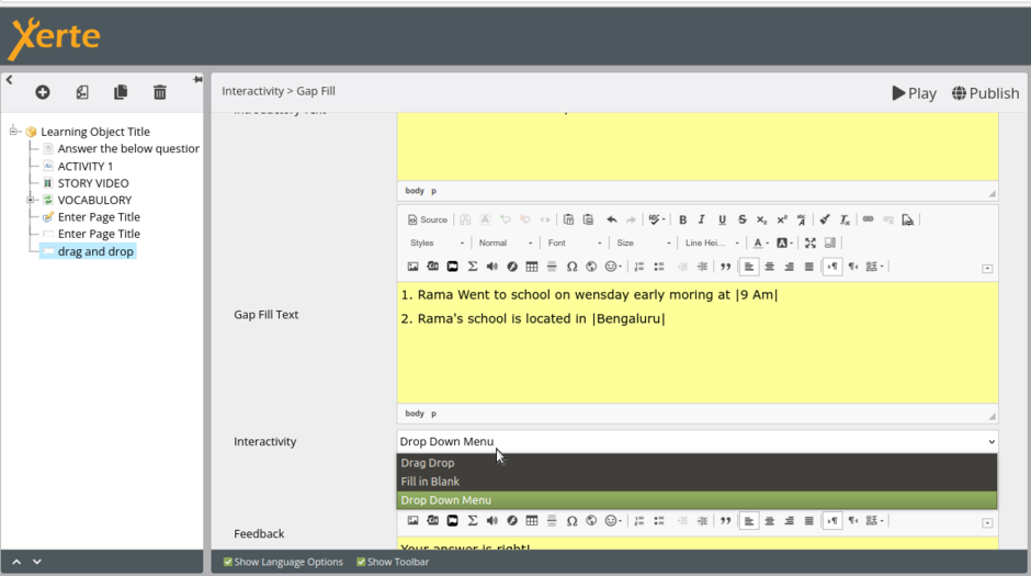
Fig23: Selecting the multiple options available in gap fill

Drag and Drop
User can mark the response after entering information in the gap fill textbox by "selecting the answer→ Right click→ Mark word". User can also add several distractors or options from optional attributes to the user to select the correct answer from a variety of options (Fig24).
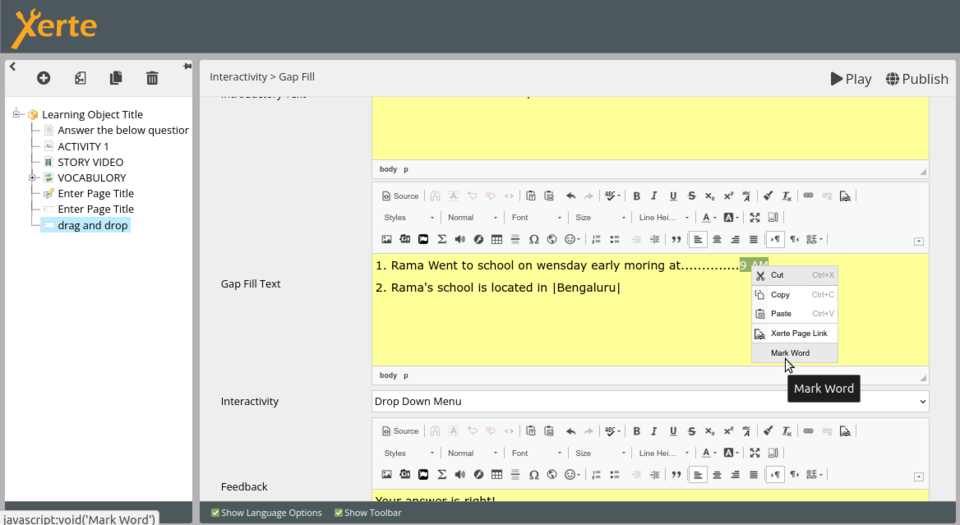
Fig24: Selecting Mark word option for answer

There may be a case where you want to use images than words as answers, follow the same steps as above, to add a picture as answer. But instead of selecting "Mark word," choose the answer text that appears in the vertical bar | | (Fig25). Next, upload the image by turning on the show toolbar option.

Fig25: Marking images as answer

Fill in blank
The user can mark the answer by "selecting the answer→ Right click→ Mark word" after entering content in the gap fill text box. This option does not allow for the addition of images; instead, the user can only enter text in this manner (Figs26 and 27).
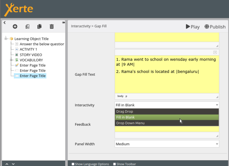
Fig26: Marking the answer and selecting option as fill in the blank
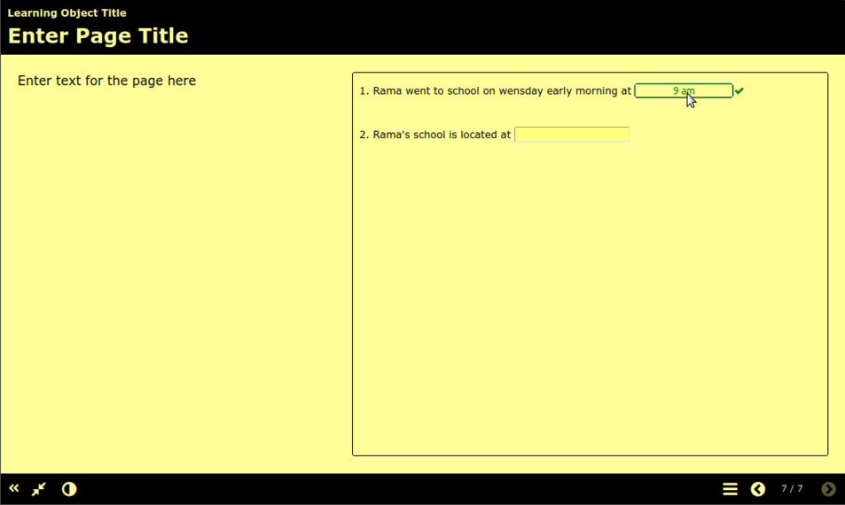
Fig27: Review of the fill in the blank option
The user can mark the answer by "selecting the answer→ Right click→ Mark word" after adding content to the gap-fill text box. In this option, the user cannot upload a picture; they are only able to provide words. The user can enter numerous responses inside the vertical bar | |, each answer being separated by the forward slash "/". The correct answer should be placed first, followed by a / add the distractors (many alternatives) (Fig28).
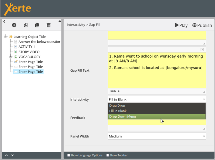
Fig28: Marking the answer and Choosing the down down option

Note: The user should activate the "Mark at end" option from the optional properties which allows the end user to choose the wrong answers. Then, after clicking "Submit" the end user will receive feedback on whether the selected response is correct or incorrect. (Figs29 and 30).

Fig29: Adding Mark at end
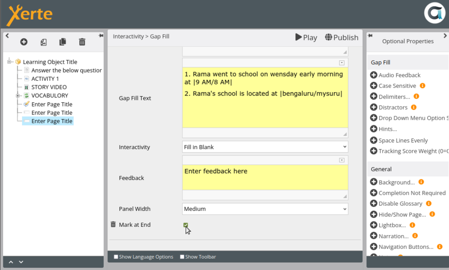
Fig30: After adding Mark at end option


Matching text
It may be quite beneficial to include a matching text element in a project so that the end user can more readily grasp the content and to make the project richer and more interactive by allowing the end user to drag and drop matching pictures, audio, or text to the initial text that is provided.
The user should choose "insert→interactive tools→Matching text" to utilize this element.
The user can add the "page title, introduction text, feedback, and attempts before hint". Once the user adds the matching text page to the project, should also add the "mark at end" option. The user must select "New sentence" from the menu in order to enter content (Fig31).

Fig31: Adding the details in matching text main page and adding "mark at end" option

After selecting "New sentence," the user may add a picture, text, or audio in part 1 and the same in part 2 so that part 1 and part 2 can be matched appropriately by the end user. To add the next content, the user should click on "New sentence" again (Fig32).
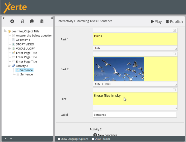
Fig32: Adding the content to matching the text

Multiple choice question
It may be highly beneficial to include a multiple choice question element in the project in order to make the information easier to grasp and to make the project richer and more interactive. The user can choose to answer the question as a true or false statement or as a multiple choice question.
Click "insert→interactive tools→Multiple choice question" to utilize this element.
The user may then add the page title, text alignment, introduction text, question, question type (whether single answer or multiple response), and panel width after adding the multiple choice question page to the project. The user must select "New Answer" from the menu in order to add the answer (Fig33).
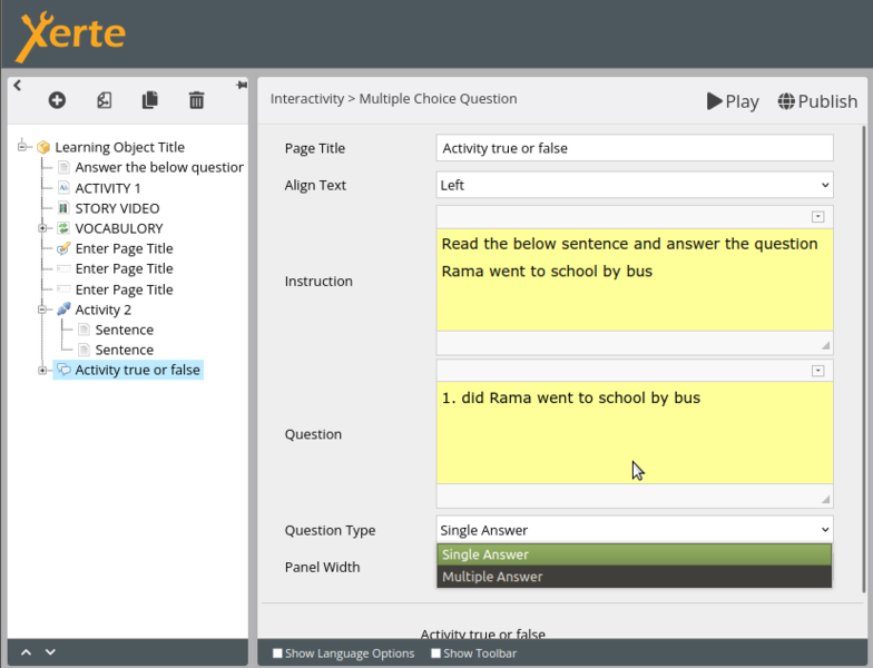
Fig33: Adding the details and question to the multiple choice question main page and clicking on new answer

Once the user finishes selecting "New answer", a new page (Fig34) will appear to make it a single answer, the user must choose as ‘single answer’ from the main page; to make it numerous answers, should select multiple answers from the main page (Fig33).
The user should include two "New answers" for questions of the true-false variety.
The user might enter two or more than two answers for multiple answers.
Note: On the New Answer screen, the user should pick the right answer as true and the incorrect response as false.

Fig34: Adding the answers for multiple choice questions

Sortable grid
The addition of a sortable grid feature to the project can assist the end user in quickly comprehending the content and enhance the project by making it more interactive. The user can use this to rearrange the sentences, words, or images that will be shown to them in a shuffled order.
The user should choose "insert→interactive tools→Sortable Grid" to utilize this element.
After adding the sortable grid page to the project, the user may then add the page title, page text, feedback (Fig35), and content to the provided table in the appropriate order. For example, by adding the first word or image to the first column, the second to the second column, and so on.

Fig35: Adding the details to the main page

Fig36: Adding the data to the table


Note: Double-clicking on data cells in tables will allow you to add content (Fig37). To change the number of rows and columns, click the add column and add row buttons, respectively.
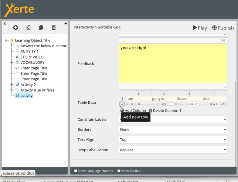
Fig37: Adding images and columns

Inserting Gaming tools
The end user will benefit from the project's inclusion of game-style activities because they will make learning enjoyable for them.
Hang man
The Hangman game uses words and phrases. Using the keyboard user starts guessing the letters.
The user must select "insert→Games→Hangman" in order to use this component.
When adding the Hangman page to the project is complete, the user can enter the page's title, instructions, and content in the words column.
In the instructions field, question can be added and the corresponding answer can be filled in the ‘words’ field as shown in Fig38.
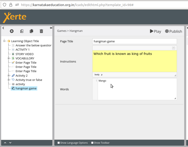
Fig38: Adding the details and content to the hangman page

The user is given the opportunity to input the phrases, and if they type the incorrect words instead of the ones that are provided, a man-hanging sketch will begin to appear. Either the end user types the entire answer correctly, the game ends with the sketch of a man hanging otherwise as shown in Fig39.
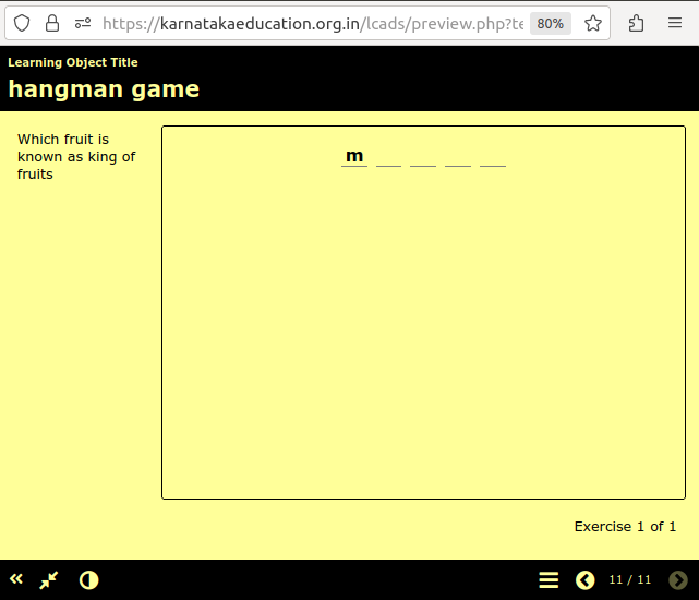
Fig39: Preview page of hangman game

Memory game
Memory game is a simple game of matching the pairs of cards.
The user should select "insert→Games→Memory game" to use this component.
Once the user has added the ‘Memory Game’ page to the project, the user can add the page title. To add the content, the user should click on "new item," which will open a new page. User should click on "label image" from the optional properties, which will get added to the project. After this, the user should upload the same image as the label image, and to add the next image, the user should click on new item again and follow the same process (Fig40).

Fig40: Adding the Label image to the project

The system is designed such that when the user clicks on a card, it flips over and displays an image, prompting them to look for that image elsewhere on the page. Two photos will be combined into one when they matched successfully as shown in Fig41.
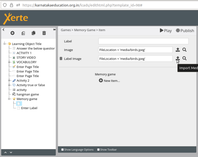
Fig41: After adding the images to image and label image
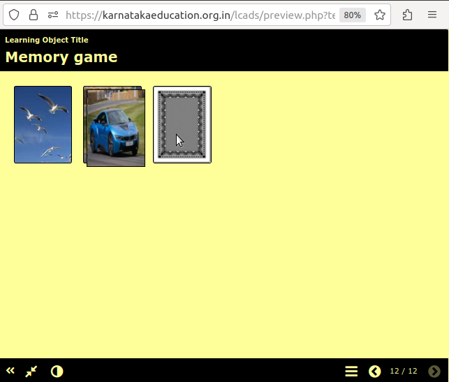
Fig42: Preview page


Word search
This is a simple game to create a wordsearch activity out of a list of words.
The user must choose "insert→Games→ Word Game" in order to use this component.
Once the Word Game page has been added to the project, the user may add the page title, instructions, and words. Each word should be added to a new line as shown in Fig43. The look of the table is in-built will be presented as a puzzle coupled with a word list that must be searched (Fig44)

Fig43: Adding the details and content to the word game
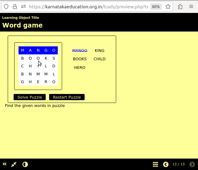
Fig44: Preview of word game


Tracking tools
Result page
The end user who will view the result page when the project is finished may be examined by including a result page. Results pages are ideal for the end of a project when you want students to reflect on how well they answered their completed activities.
The user should choose "insert→Tracking / xAPI→ Results Page" in order to use this element.
The user may add a page title and select whether to display ‘Full results’, ‘Normal results’ or ‘Minimal results’ after adding a result page to the project.
The user can additionally specify that the results must be displayed in the optional properties upon the "full completion" of the project as shown in Fig45.

Fig45: Selecting the results option and adding full completion

Importing page from other project
User can import the pages or elements from one project to another project by selecting the project and clicking on the "edit project" button to reuse the content or modify and use the content. (Figs46 and 47)
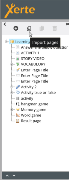
Fig46: Selecting import pages
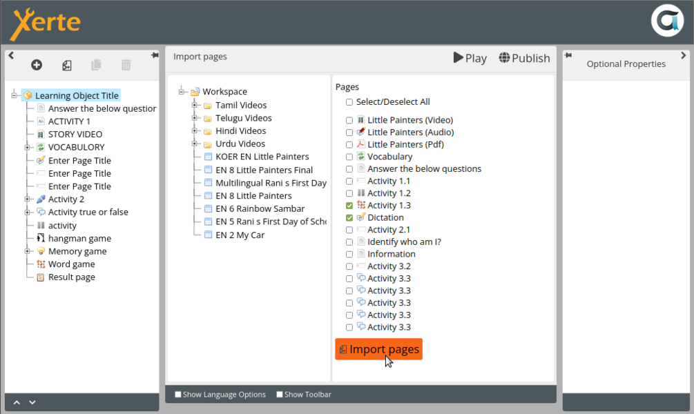
Fig47: Selecting the elements and clicking on import pages to import to current


Duplicating the page or element
In order to reuse the content and element in another project or to utilize and change the same project in a new file, the user can replicate the entire project or specific project components.
The user must first choose the project from the home page and then click the "Duplicate" option (Fig48).
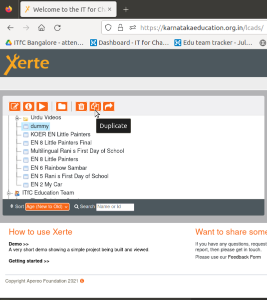
Fig48: Duplicating the project

The user should choose the project from the main page and then click "Edit Project" to duplicate an element of the project. To duplicate an element, select it and use the "Duplicate" button (Fig49).
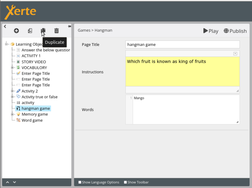
Fig49: Duplication of element of projects

Deleting of page or activity
The project or activity can be removed from Xerte by the user.
The user must choose the project from the home page and then click the "Delete" option to remove it (Fig50).
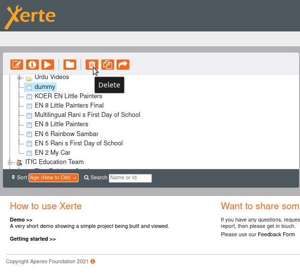
Fig50: Deletion of project

To delete the element, the user should click on the edit button by selecting the project from the main page. The user should select the element and click on the "Delete" button (Fig51).
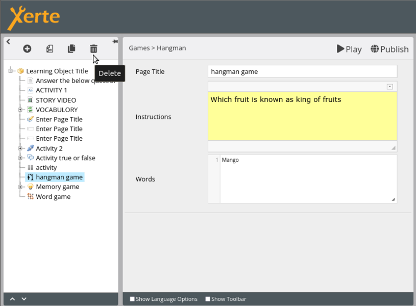
Fig51: Deletion of element from project

Optional properties
Every element has a variety of ‘optional attributes’ that may be supported by the element with more choices to enhance the project. In the descriptions above, we have listed a few of the optional properties that we utilized in our project. On the right side of project (Fig52), optional properties are displayed.
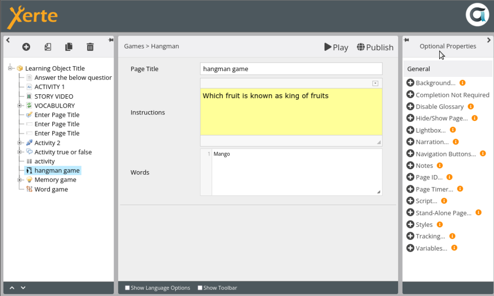
Fig52: Optional properties

Show language option and Show toolbar option
The extra formatting choices of ‘Show toolbar’ and ‘Show language’ offer more feedback and button possibilities to enhance projects (Fig53).

Fig53 Selecting show toolbar & show language options and the options available after selecting

Play and publish buttons
The "Play" and "Publish" buttons allow you to "preview" and "save" the project, respectively (Fig54).

Fig54: Play & Publish button in project page

Elements of properties in interface
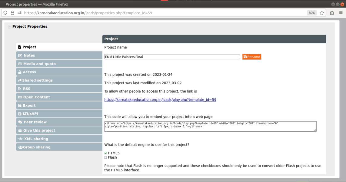
Fig55: Properties

Project
The user can get information in this tab such as project details such as(project name can be changed here), when it was created, when it was last edited, the link to access others, embedding code, etc.
Notes
The user may include an additional comment in this for their own, user's, or the end user's purposes.
Media and quota
The user may find out about the media files that have been uploaded to the project as well as its overall space in this. The user will get a list of unused files and have the choice to remove those.
Access
This allows the user to control project access as described below.
- Public
- Password-protected
- Other
- Private
Shared settings
The user will be able to decide whether to share the project with other users or a group Xerte ID and will also be able to delegate control to others as described below
• Co-author (other user will also have all the controls)
• Editor (other user will have the controls to edit and modify the project)
• Read only (other user can only read or play the project)
Open Content
This user will be in charge of granting the project's licence.
Export
It will provide the user the opportunity to export the project in various formats. Out of which offline export is the one we use to export the zip version of Xerte project.
Give this project
Other Xerte users may receive a copy of the user's project.
Group sharing
With this option, the user may give the controls as shown below and share the project with a group.
• Co-author (other user will also have all the controls)
• Editor (other user will have the controls to edit and modify the project)
• Read-only (other user can only read or play the project)
Explanation about project details
When you click on a specific project from the main page, project information is displayed as shown in Fig56, and they are provided as a number Fig56.
Fig56: Properties
- Name of the project.
- ID of the project. - Each project ends with an ID which is a unique number.
- Created date of the project.
- Last modified date of the project.
- Supported search engine type.
- URL for the public use - Through this URL anyone can access the the content of the project.
- Embed code.
- Total project size.
- Access type and number of views.
- Shared details of project.
- User name and access control details of shared user.
- Creators user name