Difference between revisions of "Learn H5P"
| (16 intermediate revisions by the same user not shown) | |||
| Line 2: | Line 2: | ||
=== Introduction === | === Introduction === | ||
| − | H5P is short for HTML5 Package and is a simple way to create and share rich and interactive web content. H5P is modular and consists of several content types and applications. This H5P will allow to teachers to create interactive learning contents and students can use those contents through computers, | + | H5P is short for HTML5 Package and is a simple way to create and share rich and interactive web content. H5P is modular and consists of several content types and applications. This H5P will allow to teachers to create interactive learning contents and students can use those contents through computers, mobiles and tablets. |
==== Basic information ==== | ==== Basic information ==== | ||
| Line 23: | Line 23: | ||
|- | |- | ||
|Development and community help | |Development and community help | ||
| − | |https://h5p.org/about-the-project | + | |[https://h5p.org/about-the-project H5P Manual] |
|} | |} | ||
| + | ==== Overview of Features ==== | ||
| + | H5P makes it easy to create, share and reuse the content and applications. H5P empowers everyone to create rich and interactive web experiences more efficiently. H5P content is responsive and mobile friendly, which means that users will experience the same rich, interactive content on computers, smartphones and tablets alike. With H5P we can create and edit interactive videos, presentations, games, advertisements and more. It is a completely free and open technology. | ||
| + | |||
| + | ==== Installation ==== | ||
| + | H5P can be accessed in two ways | ||
| + | |||
| + | 1. Through installing customized [https://teacher-network.in/OER/index.php/Learn_Ubuntu Ubuntu 20.04] in your laptop/system. | ||
| + | * After [https://teacher-network.in/OER/index.php/Learn_Ubuntu Ubuntu] installation, Go to "Applications --> Other --> H5P. The H5P will be opened in the Firefox browser. | ||
| + | * You can log in using the credentials. Username: h5p Password: h5p | ||
| + | 2. Another method for creating any interactive content in H5P is, you need to sign up on the [https://h5p.org/testdrive-h5p H5P] website & access available content types.[[File:H5p Main Page.png|center|frameless|593x593px]]{{Note}} We strongly recommend to use H5P in local host hence you can use the variety of content types which are limited in [https://h5p.org/testdrive-h5p H5P]. | ||
=== Working with application === | === Working with application === | ||
| − | + | To use any content type in H5P localhost click on "Add content --> Interactive content" and you will get a lot of content types. There are different kinds of contents you can create and here are some important ones are explained in detail in the following sections. | |
| − | |||
| − | |||
| − | |||
| − | |||
| − | |||
| − | |||
| − | |||
| − | |||
| − | |||
| − | |||
| − | |||
==== Course presentation ==== | ==== Course presentation ==== | ||
| − | The Course presentation content type allows you to create a slide-based interactive presentation of your learning material. Elements such as text, images, | + | The Course presentation content type allows you to create a slide-based interactive presentation of your learning material. Elements such as text, images, audios and videos. By combining any of these resources you can create resources. |
Also, this presentation content type allow users to add multiple choice, fill in the blanks, texts and other types of interactions with in their presentations. Presentations can be accompanied with formative self-assessments in the form of short quizzes. | Also, this presentation content type allow users to add multiple choice, fill in the blanks, texts and other types of interactions with in their presentations. Presentations can be accompanied with formative self-assessments in the form of short quizzes. | ||
| Line 56: | Line 55: | ||
2. Adding Key Words : | 2. Adding Key Words : | ||
| − | + | Keywords can be used to recognize slides and navigate between slides. | |
| − | * | + | * Click the [[File:Keyword Button.png]] Button . |
| − | * | + | * Click on "Add Keyword", using this we can add multiple key words for each slide. |
3. Adding Pictures : | 3. Adding Pictures : | ||
| Line 64: | Line 63: | ||
* Either click on it or drag the icon and place it at the location where you want to insert the picture. | * Either click on it or drag the icon and place it at the location where you want to insert the picture. | ||
* A dialogue box appears. Click on the plus sign to add image. | * A dialogue box appears. Click on the plus sign to add image. | ||
| − | * Alternative text is text that is displayed if server can’t load the image. This has to be entered in the box for Alternative text. | + | * Alternative text is a text that is displayed if server can’t load the image. This has to be entered in the box for Alternative text. |
* We can also add hover text, which is the text displayed when the viewer places his mouse pointer on the image. | * We can also add hover text, which is the text displayed when the viewer places his mouse pointer on the image. | ||
* Similarly comments can be added, opacity of the image can be varied and we can display the image as a button as well. | * Similarly comments can be added, opacity of the image can be varied and we can display the image as a button as well. | ||
| − | * | + | * Click "Done" when finished inserting the image. |
4. Adding text : | 4. Adding text : | ||
| Line 74: | Line 73: | ||
* A dialogue box will appear inside which we can enter text. | * A dialogue box will appear inside which we can enter text. | ||
* Similarly comments can be added, opacity of the image can be varied and we can display the image as a button as well. | * Similarly comments can be added, opacity of the image can be varied and we can display the image as a button as well. | ||
| − | * | + | * Click "Done" when finished inserting the text. |
5. Adding new slides : | 5. Adding new slides : | ||
| Line 82: | Line 81: | ||
6. Adding Links : | 6. Adding Links : | ||
* To add links we use the [[File:Link Button.png]] Button. | * To add links we use the [[File:Link Button.png]] Button. | ||
| − | * On clicking it, a dialogue box appears. We can type the display text for the link in the title | + | * On clicking it, a dialogue box appears. We can type the display text for the link in the title or select the text we want to convert into a link before clicking on the link icon. |
* Select suitable protocol for your link, it is usually http:// or https://. | * Select suitable protocol for your link, it is usually http:// or https://. | ||
* Type the URL to which the text is to be linked. | * Type the URL to which the text is to be linked. | ||
| − | * We can add comments and press done when finished | + | * We can add comments and press done when finished inserting the text. |
7. Adding Videos : | 7. Adding Videos : | ||
* Click on [[File:Adding Video.png]] Icon to insert videos. | * Click on [[File:Adding Video.png]] Icon to insert videos. | ||
* A dialogue box appears. | * A dialogue box appears. | ||
| − | * Videos can be inserted | + | * Videos can be inserted in the same way we do it for images. |
| − | |||
| − | |||
| − | When we choose a certain question type, a dialogue box appears, where we can enter the question and all | + | 8. Inserting Questions : When we choose a certain question type, a dialogue box appears, where we can enter the question and all its features. Then the question is added by clicking on done. |
Question types : | Question types : | ||
| Line 103: | Line 100: | ||
* Drag and Drop - [[File:Drag and Drop type.png]] | * Drag and Drop - [[File:Drag and Drop type.png]] | ||
| − | 9. Licensing : | + | 9. Licensing : Make sure all the items you take from the internet is Open Resource File meant for reuse. |
| − | |||
| − | Make sure all the items you take from the internet is Open Resource File meant for reuse. | ||
The content you create can also have licensing set, by setting it in the dialogue boxes of the object you create. | The content you create can also have licensing set, by setting it in the dialogue boxes of the object you create. | ||
==== Dialog Cards ==== | ==== Dialog Cards ==== | ||
| − | The Dialog cards content type enables you to create a set of cards with corresponding words or expressions on either side of the cards. Dialog cards can be used as a drill to help learners memorize words, expressions or sentences. | + | The Dialog cards content type enables you to create a set of cards with corresponding words or expressions on either side of the cards. Dialog cards can be used as a drill to help learners memorize words, expressions or sentences. They provide a prompt on one side of the card, and a corresponding answer on the other side. |
| − | |||
| − | |||
| − | part of the editor looks like this: | + | Now lets start creating dialog cards by selecting this option from the content types. The Dialog cards editor should now appear. The top part of the editor looks like this:[[File:Dialog Card Editor.png|center|thumb|386x386px]] |
| − | [[File:Dialog Card Editor.png|center|thumb|386x386px]] | + | * Title : This will be displayed to the learner throughout the set of cards |
| − | * | + | * Task description: In this field we can give elaborate instructions to the learner. The "Task description" is displayed throughout the entire set of cards, below the "Title". Insert the following text. |
| − | * | + | * Dialogs : Press the "Add dialog" button to add the first card. Here, "Text" means you need to type the question or any word which learning should think and answer. |
| − | * | ||
[[File:Dialogue Card 1.png|center|frameless|362x362px]] | [[File:Dialogue Card 1.png|center|frameless|362x362px]] | ||
| − | In the | + | In the "Answer" field, we provide the correct answer (this will come with the other face of the cards). Additionally you can add image and audio file under the "Image and audio" section (this is optional). |
| − | * By clicking and | + | * By clicking and "Add dialog" you can keep creating dialog cards like this in the file. |
| − | * | + | * "Save" the node/article when you're satisfied to view your final set of Flashcards. |
Dialog card [https://h5p.org/tutorial-dialog-cards#example example file] | Dialog card [https://h5p.org/tutorial-dialog-cards#example example file] | ||
| Line 129: | Line 121: | ||
Multiple Choice questions can use it for testing well-defined skills related to a certain topic. Multiple Choice questions can be an effective assessment tool when they are created properly and the learner is given immediate feedback on own performance. The H5P Multiple Choice questions can have a single or multiple correct options per question. | Multiple Choice questions can use it for testing well-defined skills related to a certain topic. Multiple Choice questions can be an effective assessment tool when they are created properly and the learner is given immediate feedback on own performance. The H5P Multiple Choice questions can have a single or multiple correct options per question. | ||
| − | 1) Getting Started : | + | 1) Getting Started : Open H5P, open new content and give a title, and then select content type as multiple choice question. On choosing the Multiple Choice type, Multiple Choice Question editor opens. It should look like this :[[File:Multiple Choice Editor.png|center|700x700px]] |
| − | |||
| − | Open H5P, open new content and give a title, and then select content type as multiple choice question. On choosing the Multiple Choice type, Multiple Choice Question editor opens. It should look like this : | ||
| − | [[File:Multiple Choice Editor.png|center|700x700px]] | ||
2) Inserting Media : | 2) Inserting Media : | ||
| Line 139: | Line 128: | ||
After this the video or image to be used can be uploaded. | After this the video or image to be used can be uploaded. | ||
| − | 3) The Question : | + | 3) The Question : The question has to be typed in the box provided for the question. This is the question for which multiple answer options are given.[[File:The Question.png|center|thumb|615x615px]] |
| − | The | + | 4) The Options : Options are choices of answers for the question. By default there are two option boxes where the text for the options can be typed. |
| − | |||
| − | + | Additional options can be inserted by clicking on add options. The correct answer can be selected by checking the correct answer checkbox.[[File:The Options.png|center|thumb|486x486px]] | |
| − | |||
| − | |||
| − | |||
| − | Additional options can be inserted by clicking on add options | ||
| − | |||
| − | The correct answer can be selected by checking the correct answer checkbox. | ||
| − | [[File:The Options.png|center|thumb|486x486px]] | ||
Tips and Feedback is used to display text to the user while selecting options. | Tips and Feedback is used to display text to the user while selecting options. | ||
| Line 160: | Line 141: | ||
Message displayed if answer is not selected is used to display text when the user does not select this option. | Message displayed if answer is not selected is used to display text when the user does not select this option. | ||
| − | 5) Feedback : | + | 5) Feedback : Multiple Choice allows the learner to get feedback on selected answering options. Feedback can be given for multiple ranges of score. Additional ranges can be added by clicking on Add Range. The Ranges can distributed into equal ranges by clicking on distribute evenly.[[File:The Feedback.png|center|thumb|479x479px]] |
| − | |||
| − | Multiple Choice allows the learner to get feedback on selected answering options. Feedback can be given for multiple ranges of score. Additional ranges can be added by clicking on Add Range. The Ranges can distributed into equal ranges by clicking on distribute evenly. | ||
| − | [[File:The Feedback.png|center|thumb|479x479px]] | ||
| − | 6) Behavioural Settings | + | 6) Behavioral Settings : This allows us to decide the way the question and the feedback. Various options exist in this. The question type option is set to automatic by default. This means the question type depends on the number of correct answers chosen. But it can be set to multiple or single choice type. The rest of the options can also be chosen based on our requirement.[[File:Behavioural Settings.png|center|499x499px|frameless]] |
| − | + | 7) Text overrides and translations : This is used to set translations on the interface for questions and options and also to determine the text of the dialogues appearing for retry and confirmation.[[File:Text overrides.png|center|494x494px|frameless]] | |
| − | [[File: | ||
| − | + | Click on "Save" and the Multiple Choice Question is ready for use. | |
| − | + | ==== Fill in the Blanks ==== | |
| − | |||
| − | |||
| − | |||
| − | |||
| − | ==== Fill in the Blanks | ||
Fill in the blanks questions are questions where a word or a phrase is missing from text, the user is asked to fill them in. Fill in the blanks can be used to test the learner's ability to reproduce facts or mathematical inferences. | Fill in the blanks questions are questions where a word or a phrase is missing from text, the user is asked to fill them in. Fill in the blanks can be used to test the learner's ability to reproduce facts or mathematical inferences. | ||
| − | 1) Getting Started : | + | 1) Getting Started : Open H5P, open new content and give a "Title", and then select content type as "Fill in the Blanks". On choosing the Fill in the Blank type, Fill in the Blank editor opens. It should look like this :[[File:Fill in the Blanks 1.png|center|frameless|416x416px]] |
| − | + | Fill in the Blanks Editor has two sections "Task description" and "Text Blocks". | |
| − | Open H5P, open new content and give a | ||
| − | [[File:Fill in the Blanks 1.png|center|frameless|416x416px]] | ||
| − | Fill in the Blanks Editor has two sections Task description and Text Blocks | ||
| − | |||
| − | |||
| − | |||
| − | |||
| − | + | a) Task description : In the Task description field we give the learner basic instructions or introduce the problem to be solved. | |
| − | Under Text blocks we add our sentences and define which words are to be remove for the learner to identify. | + | b) Text Blocks : Under Text blocks we add our sentences and define which words are to be remove for the learner to identify. |
When we enter text in the block ,Blanks are added with an asterisk (*) in front and behind the correct word/phrase. Alternative answers are separated with a forward slash (/). You may add a textual tip, using a colon (:) in front of the tip. | When we enter text in the block ,Blanks are added with an asterisk (*) in front and behind the correct word/phrase. Alternative answers are separated with a forward slash (/). You may add a textual tip, using a colon (:) in front of the tip. | ||
| Line 198: | Line 163: | ||
To add new Text blocks, click on [[File:Add Text Block.png|frameless]] | To add new Text blocks, click on [[File:Add Text Block.png|frameless]] | ||
| − | Overall Feedback, | + | Overall Feedback, Behavioral Settings and Text overrides and translation can be set the same way as in multiple choice. |
| − | ==== Drag and Drop | + | ==== Drag and Drop ==== |
Drag and drop type allows the user to create questions where one can make questions which can be answered by dragging text or images and dropping them in zones that match. Drag and drop enables the learner to associate two or more elements and to make logical connections in a visual way. | Drag and drop type allows the user to create questions where one can make questions which can be answered by dragging text or images and dropping them in zones that match. Drag and drop enables the learner to associate two or more elements and to make logical connections in a visual way. | ||
| − | 1) Getting Started : | + | 1) Getting Started : Open H5P, open new content and give a title, and then select content type as "Drag and Drop question". On choosing the "Drag and Drop type", Drag and Drop editor opens. It will look like this :[[File:Drag and Drop 1.png|center|frameless|507x507px]] |
| − | + | The editor has two windows, "Settings" tab and "Task" tab. | |
| − | Open H5P, open new content and give a title, and then select content type as Drag and Drop question. On choosing the Drag and Drop type, Drag and Drop editor opens. It will look like this : | ||
| − | [[File:Drag and Drop 1.png|center|frameless|507x507px]] | ||
| − | The editor has two windows, Settings tab and Task tab. | ||
| − | |||
| − | |||
| − | The | + | 2) Settings tab : The "Title", is the title of the the question to be displayed only when generating summaries and statistics. |
Background image can be added by clicking on [[File:Add Background Image.png|frameless]] which sets the background image of the question. | Background image can be added by clicking on [[File:Add Background Image.png|frameless]] which sets the background image of the question. | ||
| Line 218: | Line 178: | ||
Task Size sets the size of the question area | Task Size sets the size of the question area | ||
[[File:Task Size.png|center|frameless]] | [[File:Task Size.png|center|frameless]] | ||
| − | 3) Task tab : | + | 3) Task tab : The task tab is the area where we make the Drag and Drop question. The toolbar on top is what we use to create the questions,.There are 3 buttons on the toolbar, |
| − | |||
| − | The task tab is the area where we make the Drag and Drop question. The toolbar on top is what we use to create the questions,.There are 3 buttons on the toolbar, | ||
| − | |||
| − | |||
| − | Dropzones are regions where | + | a) Dropzones : Dropzones are regions where draggable text and images can be dropped. |
| − | Drag the dropzone icon and place it in the location where you want a dropzone. The instant we place the dropzone, the dropzone settings appear. Which will look like this: | + | Drag the dropzone icon [[File:Dropzone.png|frameless]]and place it in the location where you want a dropzone. The instant we place the dropzone, the dropzone settings appear. Which will look like this:[[File:Dropzone Settings.png|center|frameless|469x469px]] |
| − | [[File:Dropzone Settings.png|center|frameless|469x469px]] | + | We can set the "Label", "Opacity" and "Dropzone restrictions" using this. |
| − | We can set the | ||
| − | b) Text | + | b) Text[[File:Text.png|frameless]] : This is the icon we use to add text. Dragging this icon and placing it in the location where you want to insert the text, opens the text editor. |
| − | |||
[[File:Text Image .png|center|frameless|488x488px]] | [[File:Text Image .png|center|frameless|488x488px]] | ||
Where setting of the text and dropzones it can be placed in will be done. | Where setting of the text and dropzones it can be placed in will be done. | ||
| − | c) Image | + | c) Image[[File:Image 1.png|frameless]] : This is used to add images to the question. Dragging this icon and placing it in the location where you want the image to be, an image editor appears. It will look like this :[[File:Image editor.png|center|frameless|488x488px]] |
| − | |||
| − | This is used to add images to the question. | ||
| − | |||
| − | Dragging this icon and placing it in the location where you want the image to be, an image editor appears. | ||
| − | [[File:Image editor.png|center|frameless|488x488px]] | ||
Here we can set image settings and the dropzones it belongs to. | Here we can set image settings and the dropzones it belongs to. | ||
| − | 4) Feedback : | + | 4) Feedback : The feedback pane works the same way we used it for the multiple choice questions. |
| − | |||
| − | The feedback pane works the same way we used it for the multiple choice questions. | ||
==== Timeline ==== | ==== Timeline ==== | ||
The Timeline content type allows you to place a sequence of events in chronological order. For each event, you may add images and texts. You may also include assets from Twitter, YouTube, Flickr, Vimeo, Google Maps and SoundCloud. | The Timeline content type allows you to place a sequence of events in chronological order. For each event, you may add images and texts. You may also include assets from Twitter, YouTube, Flickr, Vimeo, Google Maps and SoundCloud. | ||
| − | To create a timeline, click on create a content type and select the | + | To create a timeline, click on create a content type and select the "New content" option and choose "Timeline" from the list of Content types: |
| − | Now, timeline editor will appear. It consists of three main parts | + | Now, timeline editor will appear. It consists of three main parts "Title", "Timeline" and "Dates" |
| − | # '''Title''' : Enter the | + | # '''Title''' : Enter the "Title", then expand the timeline section to add a "Headline" and "Body Text". Example "Prime ministers of india" |
| − | [[File:1. Time line title details.png|600px]] <br> | + | [[File:1. Time line title details.png|600px]] <br>{{Note}} If there is an online image, video or other media that you would like to display when the timeline is first seen, expand the '''Assets''' section. Add the link to '''Media''' – this is the URL to the image, video, audio or map. Add '''Credits''' and a '''Caption'''.) |
| − | |||
# '''Timeline:''' This part consists of content for a starting slide and some overall settings for the entire timeline. | # '''Timeline:''' This part consists of content for a starting slide and some overall settings for the entire timeline. | ||
[[File:2. Details about the time line.png|600px]] <br> | [[File:2. Details about the time line.png|600px]] <br> | ||
| Line 279: | Line 225: | ||
Add more events with dates as required to your timeline with the '''Add Item''' button. In the same way, fill in all the other dates with the following content. | Add more events with dates as required to your timeline with the '''Add Item''' button. In the same way, fill in all the other dates with the following content. | ||
| − | + | ==== True or False Questions ==== | |
True or False type of questions are popular when it comes about a decision on a statement. | True or False type of questions are popular when it comes about a decision on a statement. | ||
<gallery mode="packed" heights="200"> | <gallery mode="packed" heights="200"> | ||
| Line 291: | Line 237: | ||
# Click on "Save" | # Click on "Save" | ||
| − | + | ==== Drag the Words ==== | |
Drag the words is a kind of matching the answer questions where you will be given different questions with various answers. You have to drag and drop it on a blank which you think is the answer. | Drag the words is a kind of matching the answer questions where you will be given different questions with various answers. You have to drag and drop it on a blank which you think is the answer. | ||
<gallery mode="packed" heights="250"> | <gallery mode="packed" heights="250"> | ||
| Line 304: | Line 250: | ||
# Click on "Save" | # Click on "Save" | ||
| − | + | ==== Multiple Hotspots ==== | |
In an image multiple spots can be located based on user's requirement. Multiple questions with multiple answers or single question expecting multiple answers can be spotted in Multiple hotspots. | In an image multiple spots can be located based on user's requirement. Multiple questions with multiple answers or single question expecting multiple answers can be spotted in Multiple hotspots. | ||
<gallery mode="packed" heights="250"> | <gallery mode="packed" heights="250"> | ||
| Line 325: | Line 271: | ||
# Click on "Save". | # Click on "Save". | ||
| − | + | ==== Image Hotspots ==== | |
An Image hotspot is used to create a hotspot which may reveal some textual, image or video information regarding that. | An Image hotspot is used to create a hotspot which may reveal some textual, image or video information regarding that. | ||
<gallery mode="packed" heights="300"> | <gallery mode="packed" heights="300"> | ||
| Line 334: | Line 280: | ||
<gallery mode="packed" heights="200"> | <gallery mode="packed" heights="200"> | ||
File:ImageHotspot3.png|Adding text for a hotspot | File:ImageHotspot3.png|Adding text for a hotspot | ||
| − | File: | + | File:Image hotspot answer.png|Result of Image hotspot |
</gallery> | </gallery> | ||
| Line 343: | Line 289: | ||
# Once done with one hotspot you can "Add Hotspot" to spot one more item in the image and so on. | # Once done with one hotspot you can "Add Hotspot" to spot one more item in the image and so on. | ||
| − | + | ==== Flashcards ==== | |
Flashcards are a set of stylish images that are paired with questions and answers. | Flashcards are a set of stylish images that are paired with questions and answers. | ||
| + | <gallery mode="packed" heights="300"> | ||
| + | File:Flashcard question.png|Adding the Card | ||
| + | File:Flashcard result.png|Flashcard result | ||
| + | </gallery> | ||
To create a flashcard question, click on "Create a content type" and select the "New content" option and choose "Flashcard" from the list of Content types. | To create a flashcard question, click on "Create a content type" and select the "New content" option and choose "Flashcard" from the list of Content types. | ||
| Line 355: | Line 305: | ||
# To add one more image, click on "Add Card" and follow the same steps. | # To add one more image, click on "Add Card" and follow the same steps. | ||
| + | ==== Interactive video ==== | ||
| + | Interactive video adds interactivity to your video with explanations, extra pictures, tables, Fill in the Blank and multiple choice questions. They make your videos more informative and communicative. | ||
| + | <gallery mode="packed" heights="200"> | ||
| + | File:Interactive Video1.png|Adding the Interactive video question | ||
| + | File:Interactive video 2.png|Choosing Button or Poster | ||
| + | File:Interactive video 3.png|Appearance of text in the video | ||
| + | </gallery> | ||
| + | |||
| + | To create an interactive video type of question, click on "Create a content type" and select the "New content" option and choose "Interactive video" from the list of Content types. | ||
| + | |||
| + | Adding Interactive video to your page involves three steps, Upload or embed the video, Add interactions, Summary task. | ||
| + | # In the first step, video should be uploaded or embedded. If you have the copy of video then choose Upload option, link the Youtube address otherwise. Click on "Add Interactions" | ||
| + | # In the next page, you can choose the element you want to add in between the video. Available elements are Label, Text, Table, Link, Image etc. Various question types can also be included in this stage. Usually the added interaction is visible as plus mark inside the circle. Here you have two options, Button and Poster. If you choose button option, the element will be triggered if and only if you click on the Circle Plus symbol. Poster makes the element to appear directly on the video. In case of button option, you can move the Circle plus symbol so to avoid this symbol hiding your background video. Once you done with this page click on "Summary Task". | ||
| + | # If you have a question at the end of the video you can mention that in this section. You can add an "Introduction Text" with the set of statements in the "Summary" section. While giving the statements make sure that the first statement itself is the answer. Later the statements will be automatically shuffled. Click on "Save". | ||
| + | |||
| + | ====Ideas for Resource creation ==== | ||
| + | Using this tool you can create varieties of resources by attaching it to a video. You can have interactive session by putting questions of different types wherever required. You can conduct quizzes for students related to a topic of your subject. This tool also helps the students to memorize the things quickly. | ||
=== Additional references === | === Additional references === | ||
# [https://h5p.org/documentation/for-authors/tutorials Handout for content authors] | # [https://h5p.org/documentation/for-authors/tutorials Handout for content authors] | ||
Revision as of 05:33, 30 June 2022
Introduction
H5P is short for HTML5 Package and is a simple way to create and share rich and interactive web content. H5P is modular and consists of several content types and applications. This H5P will allow to teachers to create interactive learning contents and students can use those contents through computers, mobiles and tablets.
Basic information
| ICT Competency | It is a generic interactive content resource creation and editing tool. |
| Educational application and relevance | This tool can be used to create interactive content combining multiple resources like text, images, audio and video. |
| Version | NA |
| Other similar applications | Explorable Explanations |
| The application on mobiles and tablets | Any latest web browser can open play and edit h5p content. |
| Development and community help | H5P Manual |
Overview of Features
H5P makes it easy to create, share and reuse the content and applications. H5P empowers everyone to create rich and interactive web experiences more efficiently. H5P content is responsive and mobile friendly, which means that users will experience the same rich, interactive content on computers, smartphones and tablets alike. With H5P we can create and edit interactive videos, presentations, games, advertisements and more. It is a completely free and open technology.
Installation
H5P can be accessed in two ways
1. Through installing customized Ubuntu 20.04 in your laptop/system.
- After Ubuntu installation, Go to "Applications --> Other --> H5P. The H5P will be opened in the Firefox browser.
- You can log in using the credentials. Username: h5p Password: h5p
2. Another method for creating any interactive content in H5P is, you need to sign up on the H5P website & access available content types.

 Note: We strongly recommend to use H5P in local host hence you can use the variety of content types which are limited in H5P.
Working with application
To use any content type in H5P localhost click on "Add content --> Interactive content" and you will get a lot of content types. There are different kinds of contents you can create and here are some important ones are explained in detail in the following sections.
Course presentation
The Course presentation content type allows you to create a slide-based interactive presentation of your learning material. Elements such as text, images, audios and videos. By combining any of these resources you can create resources.
Also, this presentation content type allow users to add multiple choice, fill in the blanks, texts and other types of interactions with in their presentations. Presentations can be accompanied with formative self-assessments in the form of short quizzes.
Steps to create course presentation :
- Getting Started:
- Open new Creative Content Page.
- Choose Course Presentation from the list of Content types.
- The Course Presentation Editor will open. It should look like this :

2. Adding Key Words :
Keywords can be used to recognize slides and navigate between slides.
- Click the
 Button .
 - Click on "Add Keyword", using this we can add multiple key words for each slide.
3. Adding Pictures :
- We add the pictures by using the
 Button.
 - Either click on it or drag the icon and place it at the location where you want to insert the picture.
- A dialogue box appears. Click on the plus sign to add image.
- Alternative text is a text that is displayed if server can’t load the image. This has to be entered in the box for Alternative text.
- We can also add hover text, which is the text displayed when the viewer places his mouse pointer on the image.
- Similarly comments can be added, opacity of the image can be varied and we can display the image as a button as well.
- Click "Done" when finished inserting the image.
4. Adding text :
- We add text using
 Tool.
Tool. - Either click on it or drag it to the location where you want to place a text box.
- A dialogue box will appear inside which we can enter text.
- Similarly comments can be added, opacity of the image can be varied and we can display the image as a button as well.
- Click "Done" when finished inserting the text.
5. Adding new slides :
- Click on the
 Button on the bottom right corner of the editor.
 - New slide will appear on which we can create content.
6. Adding Links :
- To add links we use the
 Button.
 - On clicking it, a dialogue box appears. We can type the display text for the link in the title or select the text we want to convert into a link before clicking on the link icon.
- Select suitable protocol for your link, it is usually http:// or https://.
- Type the URL to which the text is to be linked.
- We can add comments and press done when finished inserting the text.
7. Adding Videos :
- Click on
 Icon to insert videos.
 - A dialogue box appears.
- Videos can be inserted in the same way we do it for images.
8. Inserting Questions : When we choose a certain question type, a dialogue box appears, where we can enter the question and all its features. Then the question is added by clicking on done.
Question types :
- Fill in the blanks -

- Single Choice Set -

- Multiple Choice -

- True or False -

- Drag and Drop -

9. Licensing : Make sure all the items you take from the internet is Open Resource File meant for reuse.
The content you create can also have licensing set, by setting it in the dialogue boxes of the object you create.
Dialog Cards
The Dialog cards content type enables you to create a set of cards with corresponding words or expressions on either side of the cards. Dialog cards can be used as a drill to help learners memorize words, expressions or sentences. They provide a prompt on one side of the card, and a corresponding answer on the other side.
Now lets start creating dialog cards by selecting this option from the content types. The Dialog cards editor should now appear. The top part of the editor looks like this:

- Title : This will be displayed to the learner throughout the set of cards
- Task description: In this field we can give elaborate instructions to the learner. The "Task description" is displayed throughout the entire set of cards, below the "Title". Insert the following text.
- Dialogs : Press the "Add dialog" button to add the first card. Here, "Text" means you need to type the question or any word which learning should think and answer.

In the "Answer" field, we provide the correct answer (this will come with the other face of the cards). Additionally you can add image and audio file under the "Image and audio" section (this is optional).
- By clicking and "Add dialog" you can keep creating dialog cards like this in the file.
- "Save" the node/article when you're satisfied to view your final set of Flashcards.
Dialog card example file
Multiple Choice question
Multiple Choice questions can use it for testing well-defined skills related to a certain topic. Multiple Choice questions can be an effective assessment tool when they are created properly and the learner is given immediate feedback on own performance. The H5P Multiple Choice questions can have a single or multiple correct options per question.
1) Getting Started : Open H5P, open new content and give a title, and then select content type as multiple choice question. On choosing the Multiple Choice type, Multiple Choice Question editor opens. It should look like this :

2) Inserting Media :
The Media Option is Meant for adding Images or videos to the question. Select Media type from the drop-down menu.

After this the video or image to be used can be uploaded.
3) The Question : The question has to be typed in the box provided for the question. This is the question for which multiple answer options are given.

4) The Options : Options are choices of answers for the question. By default there are two option boxes where the text for the options can be typed.
Additional options can be inserted by clicking on add options. The correct answer can be selected by checking the correct answer checkbox.

Tips and Feedback is used to display text to the user while selecting options.
Tip Text is a hint for the user before the user checks their answer.
Message displayed if answer is selected is used to display text when the user selects this option.
Message displayed if answer is not selected is used to display text when the user does not select this option.
5) Feedback : Multiple Choice allows the learner to get feedback on selected answering options. Feedback can be given for multiple ranges of score. Additional ranges can be added by clicking on Add Range. The Ranges can distributed into equal ranges by clicking on distribute evenly.

6) Behavioral Settings : This allows us to decide the way the question and the feedback. Various options exist in this. The question type option is set to automatic by default. This means the question type depends on the number of correct answers chosen. But it can be set to multiple or single choice type. The rest of the options can also be chosen based on our requirement.

7) Text overrides and translations : This is used to set translations on the interface for questions and options and also to determine the text of the dialogues appearing for retry and confirmation.

Click on "Save" and the Multiple Choice Question is ready for use.
Fill in the Blanks
Fill in the blanks questions are questions where a word or a phrase is missing from text, the user is asked to fill them in. Fill in the blanks can be used to test the learner's ability to reproduce facts or mathematical inferences.
1) Getting Started : Open H5P, open new content and give a "Title", and then select content type as "Fill in the Blanks". On choosing the Fill in the Blank type, Fill in the Blank editor opens. It should look like this :

Fill in the Blanks Editor has two sections "Task description" and "Text Blocks".
a) Task description : In the Task description field we give the learner basic instructions or introduce the problem to be solved.
b) Text Blocks : Under Text blocks we add our sentences and define which words are to be remove for the learner to identify.
When we enter text in the block ,Blanks are added with an asterisk (*) in front and behind the correct word/phrase. Alternative answers are separated with a forward slash (/). You may add a textual tip, using a colon (:) in front of the tip.
To add new Text blocks, click on 
Overall Feedback, Behavioral Settings and Text overrides and translation can be set the same way as in multiple choice.
Drag and Drop
Drag and drop type allows the user to create questions where one can make questions which can be answered by dragging text or images and dropping them in zones that match. Drag and drop enables the learner to associate two or more elements and to make logical connections in a visual way.
1) Getting Started : Open H5P, open new content and give a title, and then select content type as "Drag and Drop question". On choosing the "Drag and Drop type", Drag and Drop editor opens. It will look like this :

The editor has two windows, "Settings" tab and "Task" tab.
2) Settings tab : The "Title", is the title of the the question to be displayed only when generating summaries and statistics.
Background image can be added by clicking on  which sets the background image of the question.
Task Size sets the size of the question area

3) Task tab : The task tab is the area where we make the Drag and Drop question. The toolbar on top is what we use to create the questions,.There are 3 buttons on the toolbar,
a) Dropzones : Dropzones are regions where draggable text and images can be dropped.
Drag the dropzone icon  and place it in the location where you want a dropzone. The instant we place the dropzone, the dropzone settings appear. Which will look like this:

We can set the "Label", "Opacity" and "Dropzone restrictions" using this.
b) Text : This is the icon we use to add text. Dragging this icon and placing it in the location where you want to insert the text, opens the text editor.

Where setting of the text and dropzones it can be placed in will be done.
c) Image : This is used to add images to the question. Dragging this icon and placing it in the location where you want the image to be, an image editor appears. It will look like this :

Here we can set image settings and the dropzones it belongs to.
4) Feedback : The feedback pane works the same way we used it for the multiple choice questions.
Timeline
The Timeline content type allows you to place a sequence of events in chronological order. For each event, you may add images and texts. You may also include assets from Twitter, YouTube, Flickr, Vimeo, Google Maps and SoundCloud.
To create a timeline, click on create a content type and select the "New content" option and choose "Timeline" from the list of Content types:
Now, timeline editor will appear. It consists of three main parts "Title", "Timeline" and "Dates"
- Title : Enter the "Title", then expand the timeline section to add a "Headline" and "Body Text". Example "Prime ministers of india"
 Note: If there is an online image, video or other media that you would like to display when the timeline is first seen, expand the Assets section. Add the link to Media – this is the URL to the image, video, audio or map. Add Credits and a Caption.)
- Timeline: This part consists of content for a starting slide and some overall settings for the entire timeline.

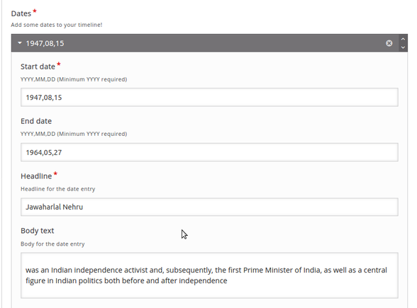
- Dates: This section the most important where you add events in time as a Date. An event “date” can be any period of time from a single day to a number of years. Start in the Dates section, by adding the Start date, End date, Headline and Body text of the first event that you would like to display to your timeline.

Your timeline with the first slide is ready now, You can check how the timeline is working using the Save button at the bottom of the screen.
Adding event details :
By clicking an add event you will add more events details to your timeline. Each event need to fill the following details :
- Start date: Event start date
- End date: Event End date
- Headline: Heading for the event
- Body text: Detail about the event
- Add event details to your timeline
Adding dates, headlines and bodytext
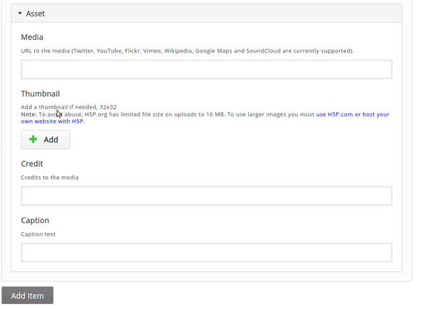
Adding media for the timeline

Under Asset
- Media: Upload your file, or copy paste any OER media links
- Credit : Enter the author/website link of the media.

Add more events with dates as required to your timeline with the Add Item button. In the same way, fill in all the other dates with the following content.
True or False Questions
True or False type of questions are popular when it comes about a decision on a statement.
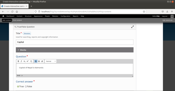
Adding True or False Question
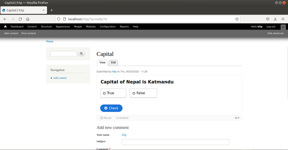
True or False question look


To create a True or False question, click on "Create a content type" and select the "New content" option and choose True/False Question from the list of Content types.
- Give the title for your question in "Title".
- Type your question in Question. Format the question if required.
- Mark the "Correct Answer" to either of True or False.
- Click on "Save"
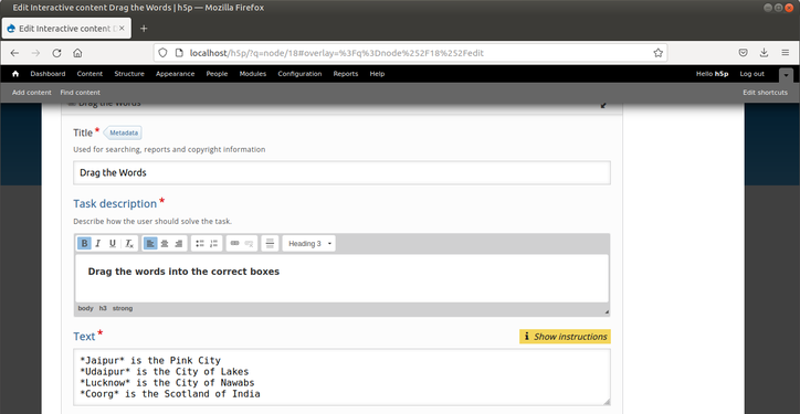
Drag the Words
Drag the words is a kind of matching the answer questions where you will be given different questions with various answers. You have to drag and drop it on a blank which you think is the answer.
Adding Drag and Drop question
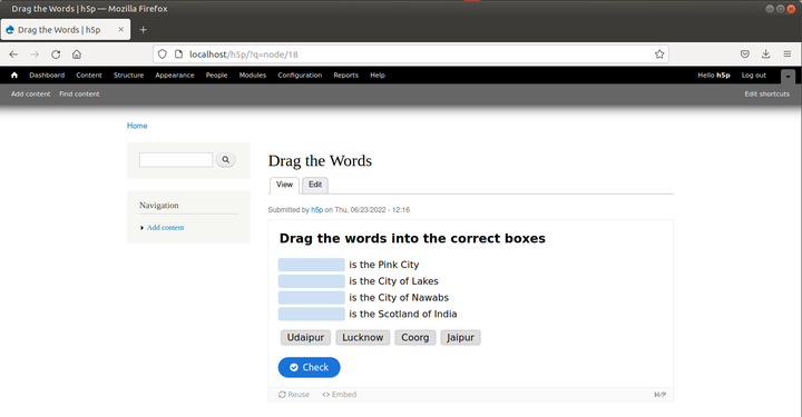
Drag and Drop question look


To create a Drag the words question, click on "Create a content type" and select the "New content" option and choose Drag the words question from the list of Content types.
- Give the title for your question.
- Describe your question in "Task Description". Format the description if required.
- In the "Text", type your questions with answers enclosed within two asterisks (*) as mentioned in the image.
- Click on "Save"
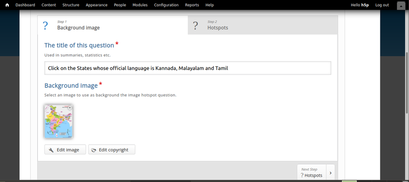
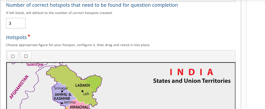
Multiple Hotspots
In an image multiple spots can be located based on user's requirement. Multiple questions with multiple answers or single question expecting multiple answers can be spotted in Multiple hotspots.
Giving the title and uploading the image
Choosing the number of correct hotspots and marking them


Marked Hotspots
Result


To create a Multiple Hotspot question, click on "Create a content type" and select the "New content" option and choose "Multiple Hotspot" from the list of Content types.
- Give the title for your question.
- Write the question in "The title of this question".
- Upload the Image. Click on Next Step (? Hotspots)
- In the next page, type the task description.
- Enter the value in "Number of correct hotspots that need to be found for question completion" (For example if you need the user to find 3 spots on an Image enter it as 3)
- In the "Hotspots" click on the circle or rectangle icon. Place and drag them on wherever required (The portion that is considered to be as the answer).
- Click on "Save".
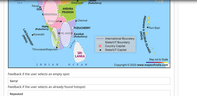
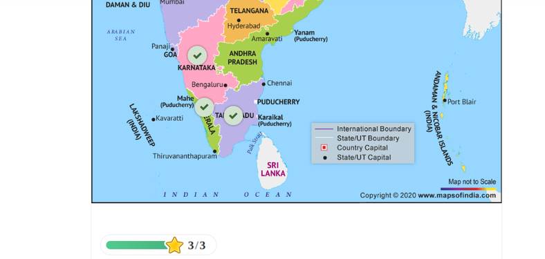
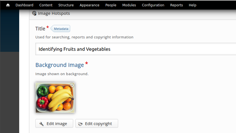
Image Hotspots
An Image hotspot is used to create a hotspot which may reveal some textual, image or video information regarding that.
Uploading background image
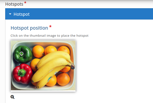
Positioning the hotspot


Adding text for a hotspot
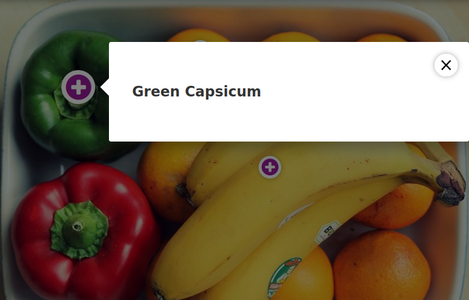
Result of Image hotspot


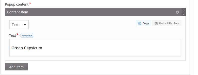
To create a Image Hotspot question, click on "Create a content type" and select the "New content" option and choose "Image hotspot" from the list of Content types.
- Give the title for your question.
- Upload the image in the "Background Image". You can change hotspot icon, predefined icon, hotspot color if needed.
- In the "Popup content" select the variety of content need to be shown when a user click on that hotspot (text, image or video). Feed the relevant content. For example, if you want to give the description for a hotspot you can enter the detailed text in the "Text" box. For "video" you can either upload the video that you already have in your system or can paste the URL of Youtube. For "Image" you can simply upload the image.
- Once done with one hotspot you can "Add Hotspot" to spot one more item in the image and so on.
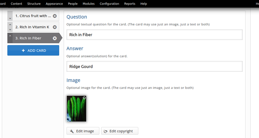
Flashcards
Flashcards are a set of stylish images that are paired with questions and answers.
Adding the Card
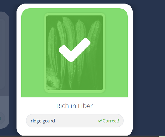
Flashcard result


To create a flashcard question, click on "Create a content type" and select the "New content" option and choose "Flashcard" from the list of Content types.
- Give the title for your question.
- Enter the Task description.
- Enter the question that is related to Image if required.
- Enter the answer.
- Upload the Image.
- Click on Save.
- To add one more image, click on "Add Card" and follow the same steps.
Interactive video
Interactive video adds interactivity to your video with explanations, extra pictures, tables, Fill in the Blank and multiple choice questions. They make your videos more informative and communicative.
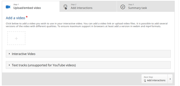
Adding the Interactive video question
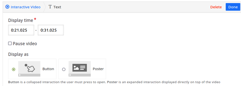
Choosing Button or Poster
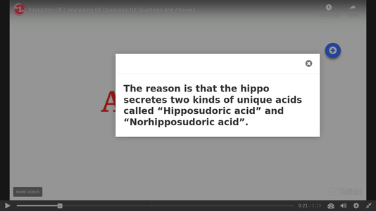
Appearance of text in the video


To create an interactive video type of question, click on "Create a content type" and select the "New content" option and choose "Interactive video" from the list of Content types.
Adding Interactive video to your page involves three steps, Upload or embed the video, Add interactions, Summary task.
- In the first step, video should be uploaded or embedded. If you have the copy of video then choose Upload option, link the Youtube address otherwise. Click on "Add Interactions"
- In the next page, you can choose the element you want to add in between the video. Available elements are Label, Text, Table, Link, Image etc. Various question types can also be included in this stage. Usually the added interaction is visible as plus mark inside the circle. Here you have two options, Button and Poster. If you choose button option, the element will be triggered if and only if you click on the Circle Plus symbol. Poster makes the element to appear directly on the video. In case of button option, you can move the Circle plus symbol so to avoid this symbol hiding your background video. Once you done with this page click on "Summary Task".
- If you have a question at the end of the video you can mention that in this section. You can add an "Introduction Text" with the set of statements in the "Summary" section. While giving the statements make sure that the first statement itself is the answer. Later the statements will be automatically shuffled. Click on "Save".
Ideas for Resource creation
Using this tool you can create varieties of resources by attaching it to a video. You can have interactive session by putting questions of different types wherever required. You can conduct quizzes for students related to a topic of your subject. This tool also helps the students to memorize the things quickly.